
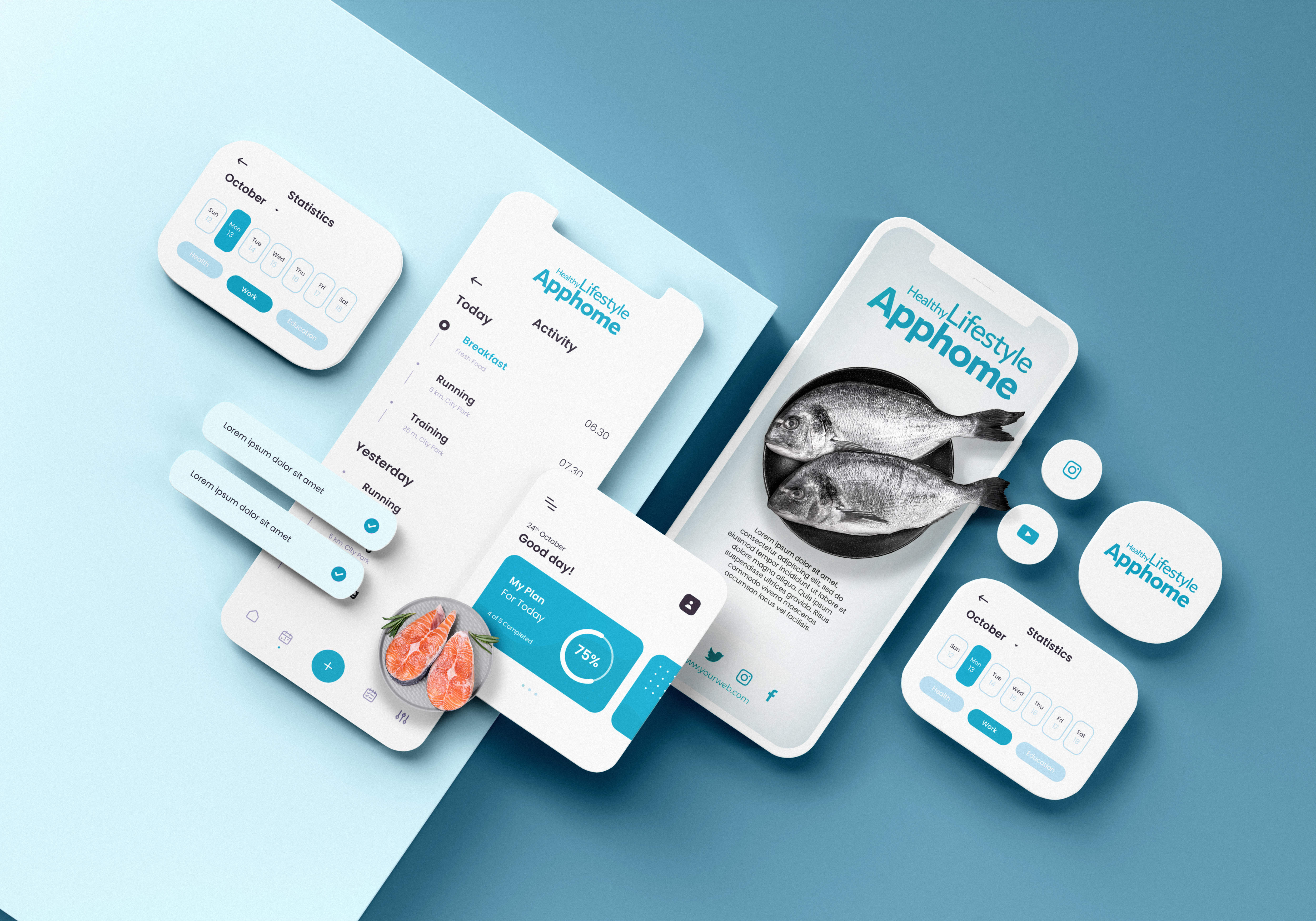
Your Mobile Site Is Your New Homepage – Why Mobile-First Design Is No Longer Optional

Not long ago, mobile websites were treated like second-class citizens—simplified versions of desktop sites, often squeezed into smaller screens without much thought for usability. But today, that dynamic has flipped entirely. Mobile is no longer just a supplementary experience. For most users, especially in Southeast Asia, mobile is the primary way people interact with your brand.
In a landscape dominated by smartphones and short attention spans, your mobile site has effectively become your new homepage. And if your site isn’t designed with a mobile-first mindset, you’re not just behind—you’re actively losing business.
This article explores why mobile-first design is now critical, what it truly means beyond just "responsive design," and how one business dramatically improved user engagement and reduced bounce rates by rethinking their mobile experience.
The Mobile Majority: A Shift in Behavior
Mobile internet usage has surged globally over the last decade, and Thailand is no exception. According to regional data, over 70% of all web traffic now originates from mobile devices. For businesses in industries like healthcare, e-commerce, beauty, travel, and services, that number can climb even higher.
Mobile isn't just a preference—it’s the default behavior. People book appointments, read reviews, compare prices, and complete purchases all on their phones—often while multitasking. If your website doesn’t support that behavior intuitively, it’s not just inconvenient—it’s unusable.
What Mobile-First Really Means
Many businesses believe they’re already mobile-friendly because they use responsive web design. But there’s a big difference between a responsive layout and a mobile-first experience.
Responsive Design = Adjusting Layouts
It ensures your site fits different screen sizes, but the design logic still starts with the desktop view.
Mobile-First Design = Prioritizing Mobile Experience
This approach starts with mobile as the primary canvas. It means:
-
Designing interfaces that are thumb-friendly
-
Structuring content in single-column, scrollable layouts
-
Optimizing for fast loading on slower mobile networks
-
Prioritizing tappable buttons over hover effects
-
Removing unnecessary features or clutter that don’t translate well to mobile
Mobile-first design isn’t just about scaling down—it’s about rethinking the user journey entirely.
Common Mobile UX Problems That Hurt Conversions
Here are some signs your current mobile experience might be driving users away:
-
Buttons or CTAs are too small or placed in unreachable zones
-
Forms require excessive typing with no auto-fill support
-
Images load slowly or are not optimized for mobile
-
Navigation menus are buried or confusing
-
Page content is too dense, requiring pinching and zooming
-
Key actions (e.g., booking, checkout) are multiple steps too deep
Each of these can frustrate users and result in a higher bounce rate—a signal to both your analytics and to Google that your site isn’t meeting user expectations.
Case Study: Transforming a Booking Platform with Mobile-First Thinking
A beauty and wellness service platform saw strong desktop engagement but couldn’t figure out why mobile conversions lagged despite accounting for more than 80% of site traffic. Their analytics revealed a troubling pattern: most mobile users landed, scrolled briefly, and left within 10 seconds.
Upon closer inspection, the issues were obvious:
-
The "Book Now" button was too small and placed near the top-right corner—hard to reach for most thumbs.
-
The service descriptions were in long paragraphs not broken up for scanning.
-
The menu required tapping three times to access popular services.
-
There was no clear progress indicator during booking.
The Redesign Approach:
-
Mobile-first wireframes were created based on real user behavior.
-
Thumb zones were mapped to reposition critical buttons within reach.
-
CTA buttons were enlarged and made sticky on the screen for easy access.
-
Content was reorganized into collapsible sections for scannability.
-
Lazy loading and image compression were implemented to speed up mobile performance.
-
Booking was condensed into three simple steps, all optimized for touch.
The Results:
Within one month of launch:
-
Bounce rate dropped by 27% on mobile sessions.
-
Time-on-site increased significantly for mobile users.
-
Booking conversions rose across all mobile devices, especially during evenings and weekends.
-
Feedback from users highlighted how much “easier” and “faster” the new site felt.
The success didn’t come from adding more features—but from removing friction.
Mobile UX Is Not Optional. It’s the Core Experience.
If your website doesn’t feel intuitive, fast, and pleasant on a phone, it simply won’t succeed in today’s market. Mobile-first design ensures you’re meeting users where they are, in the way they expect.
And it doesn’t just improve engagement—it also benefits your SEO:
-
Google’s Mobile-First Indexing prioritizes your mobile version for search ranking
-
Better Core Web Vitals (like speed and responsiveness) improve visibility
-
Lower bounce rates send positive signals to search algorithms
Final Thoughts: Start Small, Think Mobile
Redesigning for mobile-first doesn’t mean starting from scratch. Begin with your most critical user journeys—booking a service, filling out a form, or reading a product description. Optimize these first for mobile usability, clarity, and speed.
Ask yourself:
-
Can users complete this action with one hand?
-
Can they scan this content in under 10 seconds?
-
Are we helping them decide, or slowing them down?
In 2025 and beyond, the best digital experiences won’t be “mobile-compatible.” They’ll be mobile-native.


Subscribe to follow product news, latest in technology, solutions, and updates
บทความอื่นๆ


Let’s build digital products that are simply awesome !
We will get back to you within 24 hours!ติดต่อเรา Please tell us your ideas.


 28/11 Soi Ruamrudee, Lumphini, Pathumwan, Bangkok 10330+66 62 389 4599hello@sennalabs.com© 2022 Senna Labs Co., Ltd.All rights reserved.