Why Responsive Design Matters: The Key to a Successful Website in the Modern Digital Age
Share

In today’s digital world, where users access websites from a variety of devices—including smartphones, tablets, laptops, and desktop computers—responsive design has become an essential part of web development. A website that adjusts seamlessly to different screen sizes and resolutions provides an optimal user experience, improves search engine rankings, and enhances business success.
Despite its importance, many businesses and individuals still overlook responsive design, leading to poor user engagement, lower conversion rates, and decreased visibility in search engines. This article explores why responsive design matters, the benefits it offers, and how it impacts businesses, SEO, and user experience.
What Is Responsive Web Design?
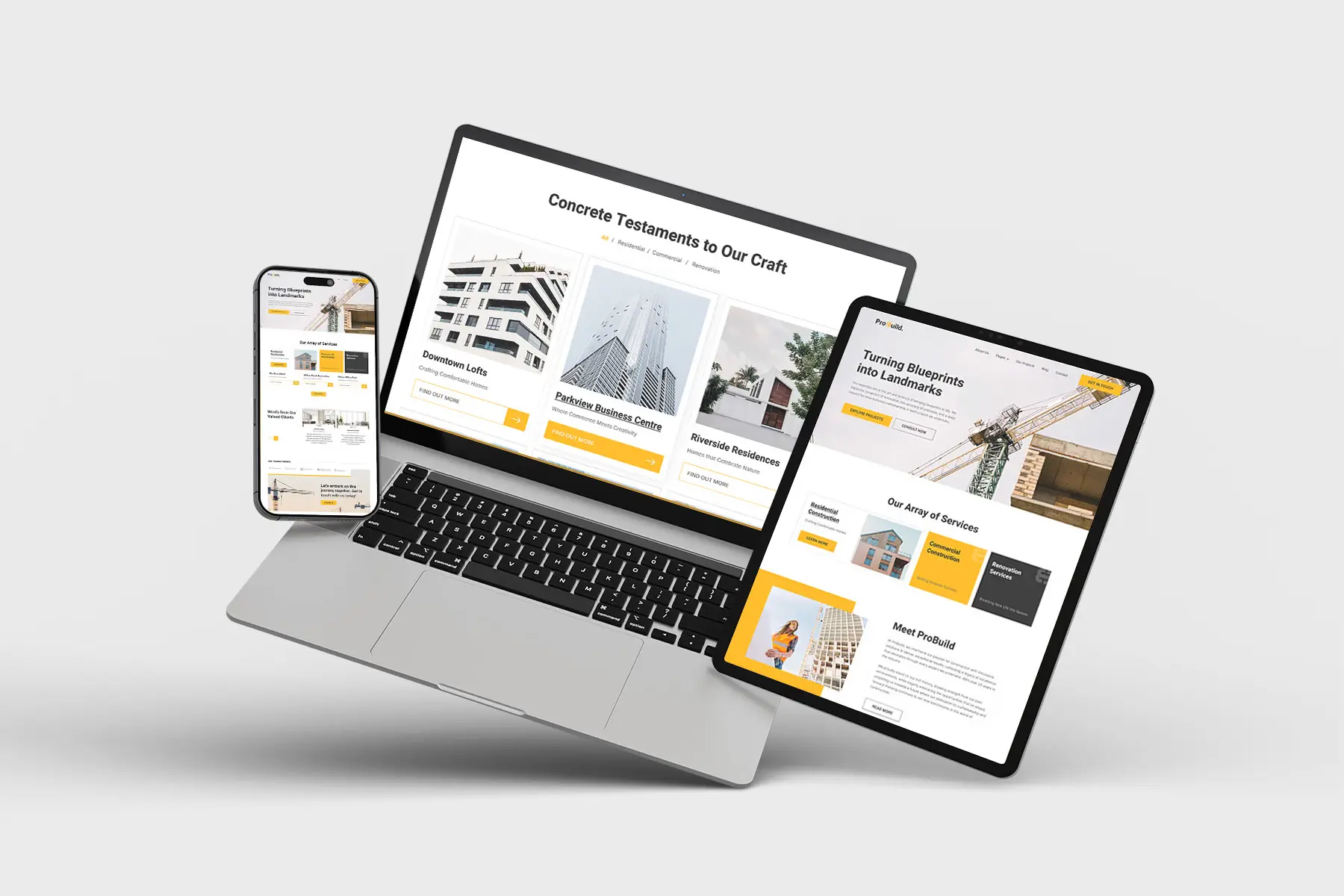
Responsive web design (RWD) is a web development approach that allows websites to adapt to various screen sizes and resolutions without requiring separate designs for different devices. It uses fluid grids, flexible images, and CSS media queries to ensure that content is easily readable and navigable across all screen types.
Instead of creating multiple versions of a website for different devices, a single responsive design dynamically adjusts the layout, images, and text to fit the screen size. This makes websites more user-friendly, accessible, and efficient for visitors, regardless of the device they use.
Why Responsive Design Matters
1. Mobile Usage Is Dominating the Internet
Over the past decade, mobile internet usage has surpassed desktop browsing. With billions of people accessing the web via mobile devices, websites that do not cater to mobile users risk losing a significant portion of their audience.
A website that is not mobile-friendly leads to:
-
Poor user experience (users struggle to navigate or read content)
-
Higher bounce rates (users leave immediately due to frustration)
-
Lower engagement and conversion rates
A responsive website ensures that mobile users can effortlessly access information, navigate through pages, and complete transactions, regardless of their device.
2. Better User Experience (UX) and Increased Engagement
User experience is one of the most critical factors in determining the success of a website. When users encounter a website that is difficult to navigate, slow to load, or requires excessive zooming and scrolling, they are likely to leave and never return.
A responsive design improves UX by:
-
Providing a consistent look and feel across all devices
-
Ensuring readable text and properly sized images without manual adjustments
-
Enhancing navigation and interactive elements, making it easier to explore content
A better UX translates into longer session durations, increased page views, and higher engagement levels, which are all critical for the success of any website.
3. Search Engine Optimization (SEO) Benefits
Search engines prioritize mobile-friendly and user-friendly websites in their rankings. Websites that offer a seamless experience across devices tend to perform better in search engine results pages (SERPs).
Here’s how responsive design helps with SEO:
-
Google’s Mobile-First Indexing: Google now primarily uses the mobile version of a site for indexing and ranking. A non-responsive site will suffer in search rankings.
-
Faster Page Load Speeds: Responsive sites are optimized to load quickly on all devices, which improves user experience and reduces bounce rates—a key factor for SEO.
-
Lower Duplicate Content Issues: Maintaining separate desktop and mobile websites can cause duplicate content problems, leading to SEO penalties. A single responsive site eliminates this issue.
By implementing responsive design, website owners can improve visibility in search engines, attract more organic traffic, and boost their online presence.
4. Higher Conversion Rates and Sales
A responsive website does more than just attract visitors—it helps convert them into customers. Many online purchases, form submissions, and sign-ups happen on mobile devices. If a website is difficult to navigate on a phone or tablet, users will abandon the process and look for alternatives.
Benefits of responsive design for conversions:
-
Seamless checkout process: No frustrating zooming or resizing needed to complete transactions
-
Consistent experience across devices: Users who visit the site on mobile and later return via desktop will see the same design and content
-
Higher trust and credibility: A professional, mobile-friendly website builds confidence in the brand
Companies that optimize their websites for responsiveness often see lower cart abandonment rates, increased leads, and higher sales figures.
5. Cost Efficiency and Easier Maintenance
Before responsive design became standard, businesses used separate mobile and desktop versions of their websites. This approach was costly, time-consuming, and inefficient. Maintaining multiple versions of the same website requires extra work, including updating content, fixing bugs, and managing SEO efforts separately.
With responsive design, there is only one website to manage, leading to:
-
Lower development and maintenance costs
-
Less time spent on updates and modifications
-
Consistent branding and content across all platforms
For businesses with limited budgets, responsive design is a cost-effective solution that ensures they remain competitive in the digital space.
6. Adaptability for Future Devices
As new devices and screen sizes emerge, a responsive website automatically adapts without requiring a complete redesign. This future-proof approach ensures that businesses do not need to constantly update their website to accommodate new devices.
Responsive design ensures that websites remain:
-
Compatible with all current and upcoming devices
-
Flexible and scalable as technology evolves
-
Sustainable in the long run, reducing the need for frequent redesigns
By adopting responsive design, businesses future-proof their online presence, ensuring long-term usability and accessibility.
How to Ensure a Website Is Responsive
For those considering a responsive design strategy, here are some key steps to take:
-
Use a Mobile-First Approach: Design for mobile screens first, then scale up for larger screens.
-
Test on Multiple Devices: Regularly check how the website appears on different screen sizes, from smartphones to large monitors.
-
Optimize Images and Media: Use scalable images and responsive media elements to ensure fast load times.
-
Ensure Fast Loading Speeds: Reduce unnecessary scripts, optimize code, and leverage caching techniques.
-
Use Flexible Grids and Layouts: Avoid fixed-width designs and use fluid grids that adjust dynamically.
There are many tools available to test a website’s responsiveness, such as Google’s Mobile-Friendly Test and browser developer tools.
Final Thoughts
Responsive design is no longer an optional feature—it is a necessity. With the increasing dominance of mobile browsing, the demand for seamless, fast, and accessible web experiences continues to rise.
A responsive website provides better user experience, improved SEO, higher conversion rates, and long-term cost efficiency. It allows businesses and individuals to stay competitive in an ever-evolving digital landscape.
For any website owner, embracing responsive web design is one of the best investments they can make to ensure usability, engagement, and success in the digital era.

Share

Keep me postedto follow product news, latest in technology, solutions, and updates
Related articles
Explore all