
Online Forms Anyone Can Fill Out Without Frustration

Forms are one of the most common interactions on the web. Whether it’s signing up for a service, applying for a job, or submitting tax information, users are constantly expected to input personal data online. But for many, forms are a source of stress and confusion—especially when they're poorly designed.
From unclear labels to error messages that appear only after submission, small oversights in form design can lead to big accessibility and usability problems. This article explores how simple changes like clear field labels and real-time validation can transform a frustrating experience into a smooth one for all users. We'll also highlight a real-world example where a government portal reduced user errors significantly by implementing these techniques.
Why Form Design Matters
Forms may seem straightforward, but they are a major pain point for users—especially those with cognitive impairments, limited digital literacy, or non-native language proficiency. A confusing form can stop someone from completing a job application, accessing government services, or even voting.
Designing accessible, user-friendly forms isn’t just about helping people with disabilities—it’s about helping everyone succeed the first time.
Key Elements of Accessible, Frustration-Free Forms
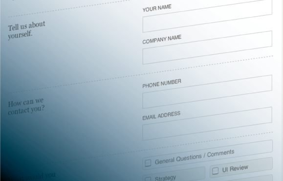
1. Clear, Descriptive Labels
Each field in a form should have a label that clearly describes what the user is expected to enter. Avoid placeholder text as a substitute for labels—it disappears as soon as users start typing, and can cause confusion or mistakes.
Good labels:
-
Are concise and consistent
-
Use simple language
-
Are placed above or beside the input field
-
Clearly associate with the correct field (especially important for screen reader users)
For example, instead of labeling a field as "Name", consider splitting it into "First Name" and "Last Name" to avoid ambiguity.
2. Real-Time Validation and Error Messaging
Real-time validation provides immediate feedback when a user makes a mistake—before they submit the form. This reduces frustration and increases the chance of a successful submission.
Best practices include:
-
Indicating errors as soon as the user leaves a field (on blur)
-
Clearly stating what the error is and how to fix it
-
Using red or bold text for error messages, paired with an icon or focus outline
-
Placing the error message close to the relevant field
For example, instead of waiting until the form is submitted to say "Password must be at least 8 characters," notify the user immediately after they finish typing a short password.
3. Logical Flow and Grouping
Grouping related fields together (like address or contact details) helps users make sense of the form’s structure. Breaking long forms into smaller sections or steps can also reduce cognitive load and prevent abandonment.
Make sure the tab order is logical and intuitive for keyboard users, and always provide a progress indicator in multi-step forms.
4. Clear Instructions and Examples
If certain fields have specific requirements—such as date formats or ID numbers—provide examples or instructions nearby.
Example:
-
Label: “Date of Birth”
-
Hint: “Format: MM/DD/YYYY”
This reduces errors and gives users confidence that they're entering the correct information.
5. Success Messages and Confirmation
After submission, users should receive a clear confirmation that the form was successfully submitted. This could include:
-
A success message
-
A summary of submitted information
-
Next steps or contact information if follow-up is needed
Avoid vague phrases like “Submission received” without additional context.
Real Use Case: A Government Portal Gets It Right
A national government portal, used by millions of citizens for everything from applying for public services to registering vehicles, was experiencing high error rates on its online registration forms. Many users—especially older adults and those with limited internet experience—were submitting forms with incorrect or incomplete data.
To address this, the development team made key improvements:
-
Introduced real-time field validation for critical inputs like ID numbers and postal codes
-
Added inline error messages that clearly explained what went wrong and how to fix it
-
Used consistent, plain-language labels and examples for all fields
-
Included accessibility enhancements for screen reader and keyboard users
The results were immediate and measurable. Form completion rates increased, and customer service inquiries related to failed registrations dropped significantly. Most importantly, more citizens were able to complete their applications on their own—without frustration or outside assistance.
Final Thoughts
Poorly designed forms create barriers. But with a few thoughtful changes—clear labels, instant validation, accessible structure—we can make forms that are simple, intuitive, and usable by everyone.
When people feel confident filling out your forms, they’re more likely to complete them successfully and return in the future. Whether you're building a government portal, a business registration form, or a contact page, designing with clarity and accessibility in mind benefits all users—not just those with disabilities.
Online forms should help people, not hinder them. With the right approach, they can be one of the most inclusive parts of your website.


Subscribe to follow product news, latest in technology, solutions, and updates
Other articles for you


Let’s build digital products that are simply awesome !
We will get back to you within 24 hours!Go to contact us Please tell us your ideas.


 28/11 Soi Ruamrudee, Lumphini, Pathumwan, Bangkok 10330+66 62 389 4599hello@sennalabs.com© 2022 Senna Labs Co., Ltd.All rights reserved.