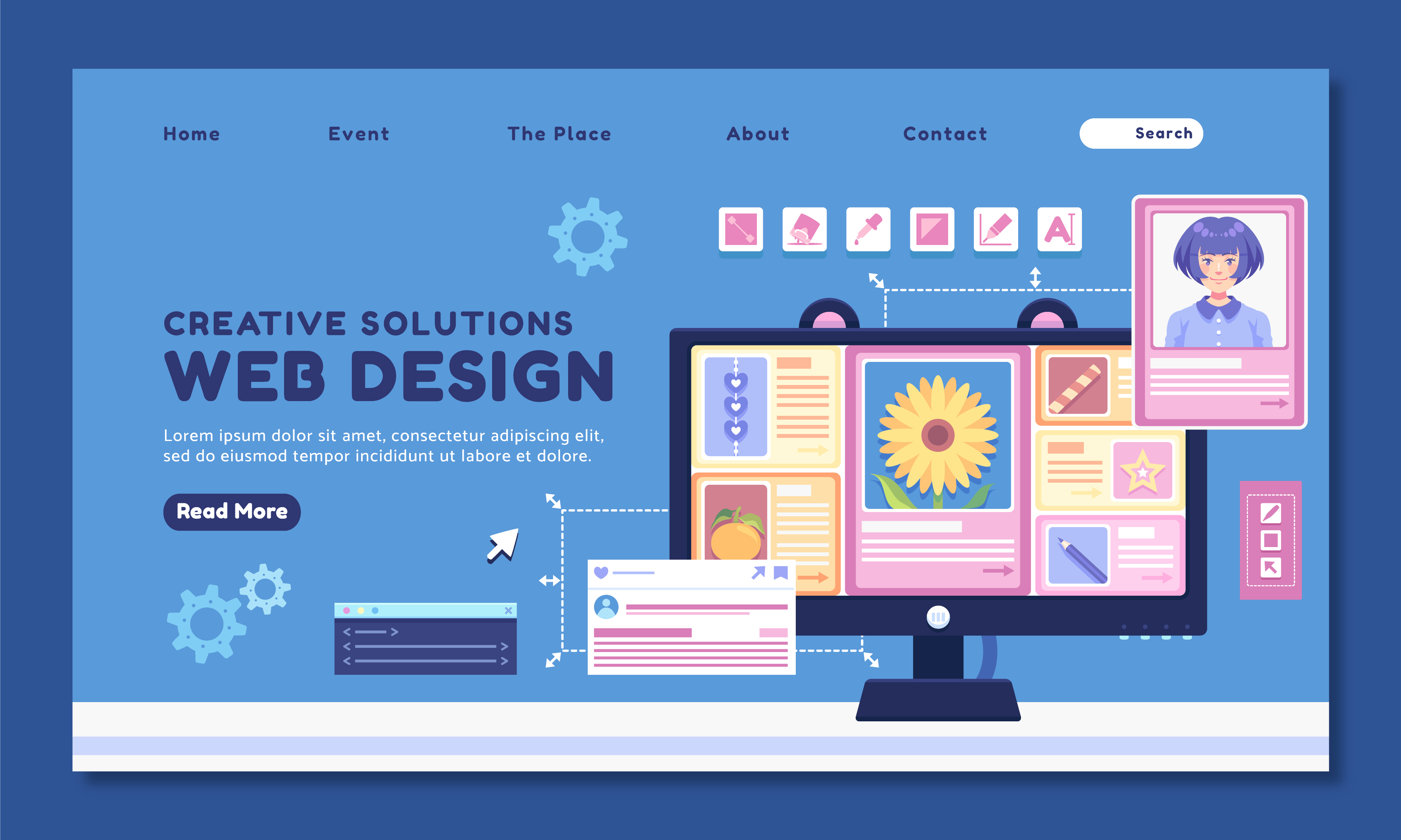
First Impressions in 5 Seconds: How to Design a Hero Section That Hooks
Share

The moment a visitor lands on your website, the countdown begins. You have just five seconds—or less—to capture attention, communicate value, and direct action. That means your hero section—the part of your website users see first—has a heavy lift. It’s not just visual. It’s strategic.
In today’s fast-scrolling digital world, your hero section can either engage visitors immediately or push them to bounce. So how do you design a hero section that not only grabs attention but also converts?
In this article, we break down the anatomy of a high-performing hero section and show how a small change in design helped a fashion brand double its homepage click-through rate.
Why the Hero Section Matters
Your hero section is the first impression your brand makes. It sets the tone for everything that follows. Done right, it:
-
Clearly communicates your main offer or message
-
Guides users toward a desired action
-
Builds immediate visual interest and brand trust
Done poorly, it confuses or bores users—and they’re gone before they even scroll.
Common Mistakes That Kill Engagement
-
Auto-sliding carousels that move too fast or don’t load well
-
Generic or abstract imagery that doesn’t communicate value
-
Weak headlines that don’t explain what the site is about
-
Invisible or low-contrast CTAs
-
Cluttered layouts with too much copy or conflicting visuals
These issues are especially problematic on mobile, where screen space and user patience are even more limited.
Case Study: A Fashion Brand Replaces Carousel with Clear Messaging
A fashion e-commerce brand had a common setup: a rotating hero banner showcasing multiple product lines with changing headlines. While visually appealing, analytics revealed that most users didn’t interact with the carousel at all.
The Problems:
-
The slider was slow to load, especially on mobile
-
Users didn’t stick around long enough to see all the slides
-
The main CTA was inconsistent and often missed
The Solution:
-
Replaced the slider with a single, static image
-
Chose a visually bold product photo with brand colors
-
Used a clear headline: “50% Off Today Only”
-
Added a single, high-contrast CTA button: “Shop Now”
-
Optimized for mobile with a full-width layout and touch-friendly design
The Results:
-
Homepage click-throughs to products doubled within the first week
-
Bounce rate decreased, especially among first-time mobile visitors
-
Sales during promotional periods saw noticeable lift
The secret wasn’t more design complexity—it was clarity and focus.
How to Build a Hero Section That Converts
1. Lead with a Clear, Strong Headline
This should be:
-
Direct (e.g., “Get 25% Off Your First Order”)
-
Benefit-focused (e.g., “Boost Productivity with Smart Automation”)
-
No more than 1–2 lines
Think clarity, not cleverness.
2. Add a Compelling Subheadline
This reinforces your headline with a bit more detail or a differentiator.
Example:
-
Headline: “All-Natural Skincare That Works”
-
Subheadline: “Clinically tested. Free from harmful chemicals.”
3. Use One High-Impact Visual
Choose an image that:
-
Supports the message (e.g., product in use)
-
Is high-resolution and fast-loading
-
Is optimized for both desktop and mobile
-
Avoids clutter or confusing composition
Tip: Faces and human interaction often outperform abstract graphics.
4. Include One Primary CTA (Call to Action)
Don’t ask users to do five things. Ask them to do one.
Examples:
-
“Shop Now”
-
“Get Started”
-
“Book a Free Demo”
-
“Join for Free”
Use bold, contrasting colors and make the button large enough to tap on mobile.
5. Keep It Above the Fold
Make sure all key elements—headline, subheadline, image, CTA—are visible without scrolling, especially on mobile. Test this on multiple screen sizes.
Optional Additions That Work
-
Trust badges: "As seen in", "Free Shipping", or "4.9 Stars on Google"
-
Urgency: “Offer ends in 2 hours!”
-
Social proof: “Over 10,000 happy customers”
These add context and boost confidence—but only if they don’t crowd the space.
Mobile-Specific Tips
-
Use larger text sizes and buttons
-
Test for vertical stacking (image > headline > CTA)
-
Avoid background videos or heavy graphics
-
Ensure the CTA is always tap-ready and doesn’t require zooming
What to Avoid
-
“Hero paralysis”: trying to say everything at once
-
Sliders with auto-play (studies show users ignore the second and third slides)
-
Overused stock images
-
CTA buttons that don’t look clickable or blend into the background
Final Thoughts: Simplicity is the New Bold
Your hero section should tell users what you do, why it matters, and what they should do next—all within seconds. It's not about being flashy; it’s about being effective.
Strip away the distractions. Focus the message. Make the call to action obvious. The result? Visitors who actually stick around—and convert.

Share

Keep me postedto follow product news, latest in technology, solutions, and updates
Related articles
Explore all