Too Many Menu Options? Here’s How to Improve E-Commerce UX
Share

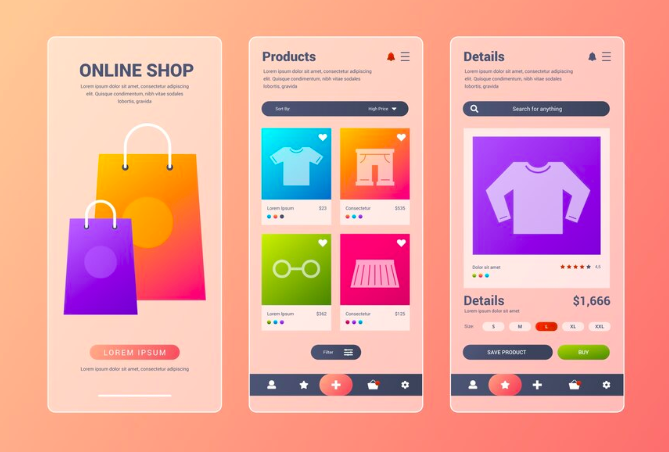
In the world of e-commerce, your navigation menu is more than a list of links—it’s the map that guides users toward the products they want. But what happens when that map is cluttered, complex, or confusing?
Simple: visitors leave.
Poorly structured menus are one of the most common—and fixable—UX problems for online retailers. In this article, we’ll explore how simplifying your navigation not only improves user experience, but also directly impacts bounce rates, page views, and conversions.
Real Use Case: Simplifying Menus to Drive Engagement
A baby product e-commerce store had built a large inventory over time. With growth came complexity: their main menu had four levels of categories, subcategories, and nested links. Customers often got lost in the hierarchy, unsure of how to find essentials like baby bottles, toys, or strollers.
Analytics revealed:
-
High bounce rates from the homepage
-
Low click-through to product pages
-
Frustrated feedback from mobile users
To solve this, the brand restructured its navigation:
-
Reduced menu depth from four levels to two
-
Introduced icon-based categories for visual clarity (e.g., diapers, toys, food)
-
Added breadcrumbs on all product pages so users could retrace their steps easily
The Result:
-
Bounce rate dropped by 22%
-
Product page views nearly doubled
-
Customers reported easier browsing and faster discovery
This simple UX fix had a major business impact.
Why Navigation Simplicity Matters
Your menu is often the first interaction users have with your content. A complicated or overwhelming menu causes:
-
Decision fatigue
-
Slower browsing
-
Abandoned sessions
Good UX focuses on clarity over coverage. You don’t have to show everything up front—just the essentials that guide users effectively.
Signs Your Menu May Be Overloaded
-
Menu dropdowns that require scrolling or clicking multiple times
-
Categories with vague or duplicated labels
-
High homepage bounce rates
-
Low engagement on second- or third-level category pages
-
Mobile users struggling to tap or swipe accurately
If any of these sound familiar, it’s time to rethink your navigation.
How to Improve Menu UX in E-Commerce
1. Flatten Your Menu Structure
Limit yourself to one or two levels:
-
Main categories (e.g., Baby Care, Toys, Feeding, Clothing)
-
Subcategories (e.g., Under “Toys”: Learning Toys, Soft Toys, Outdoor Play)
Avoid deep trees. Keep it intuitive and scannable.
2. Use Visual Cues and Icons
Icons next to categories enhance understanding, especially for:
-
Non-native language users
-
Mobile users who scan quickly
For example, a bottle icon for “Feeding” or a teddy bear for “Toys” immediately communicates the category.
3. Enable Breadcrumb Navigation
Breadcrumbs (e.g., Home > Toys > Learning Toys > Flashcards) show users where they are and how to go back. They:
-
Reduce confusion
-
Improve findability
-
Enhance SEO with structured data
4. Group Smart, Not Just by Product
Don’t just categorize by type—consider use case:
-
“Newborn Essentials”
-
“Top-Rated by Parents”
-
“Gifts Under $30”
This user-centered thinking often leads to better engagement than rigid category trees.
5. Make It Mobile-First
Mobile menus should:
-
Use accordion-style drop-downs for easy expansion
-
Feature large, tappable areas
-
Collapse after selection to maximize screen space
Always test menu behavior on both Android and iOS devices.
6. Test, Iterate, and Use Analytics
Use heatmaps and click tracking to see:
-
Which menu items get the most attention
-
Where drop-offs happen
-
Which categories need restructuring or renaming
Use A/B testing to compare menu versions and validate improvements.
Other Enhancements That Support Navigation
-
Search bar with auto-suggest: As a backup for users who prefer search
-
Sticky headers: Keep navigation accessible during scrolling
-
Mega menus: For large catalogs, display all subcategories in a wide-format layout
Just be cautious: mega menus work best on desktop, and must be adapted thoughtfully for mobile.
Final Thoughts
E-commerce UX isn’t just about aesthetics—it’s about utility. Your navigation menu should be a smooth, logical path that helps users reach their destination without friction.
By simplifying your structure, adding helpful cues like icons and breadcrumbs, and thinking from the user’s perspective, you remove roadblocks and unlock a better shopping experience.
And as the baby product store proved, a cleaner menu isn’t just good UX—it’s good business.

Share

Keep me postedto follow product news, latest in technology, solutions, and updates
Related articles
Explore all