Simplicity in UX/UI: How Reducing Clutter Can Improve Your Website’s Performance
Share

In the digital world, where attention spans are getting shorter, website visitors often leave a site within seconds if they feel overwhelmed or confused. As a result, reducing clutter and focusing on simplicity in UX/UI design is more important than ever. For blogs, especially those that cover a wide range of topics, maintaining a clean and focused user interface (UI) can lead to significant improvements in user engagement, longer visits, and lower bounce rates.
In this article, we’ll explore how simplifying your website design can improve performance, specifically for blogs with diverse content. By focusing on user-centric design and eliminating unnecessary elements, you can enhance the experience for your visitors, boost engagement, and increase time spent on your site.
The Problem: Overwhelming Content and High Bounce Rates
For many blogs, particularly those that cover a wide variety of topics, it’s easy to overwhelm visitors with too much content at once. If the design is cluttered with excessive text, distracting advertisements, multiple pop-ups, and complicated navigation, users may feel lost and quickly exit the site.
A blog that covers a diverse set of topics, such as lifestyle, technology, health, and entertainment, runs the risk of providing a chaotic user experience. If visitors are greeted by a dense homepage with too many choices, it can be difficult for them to know where to start or what’s important. This confusion can lead to high bounce rates, where visitors leave without engaging further or exploring more content.
The Solution: Simplifying UX/UI Design
By reducing visual clutter and focusing on simplicity, you can create a more enjoyable user experience, guiding your visitors to the most important content and improving overall site performance. Let’s take a look at several key principles of simplicity in UX/UI design that can help reduce clutter and improve user engagement.
1. Clean, Uncluttered Layouts
One of the first steps in simplifying your website’s design is to create a clean, minimalistic layout. Avoid cramming too many elements onto the page and focus on giving each section enough breathing room. An organized layout ensures that the most important content stands out, making it easier for users to navigate.
-
White Space: Incorporate generous amounts of white space (also known as negative space) between content blocks. This makes the page feel less crowded and gives visitors the chance to focus on one thing at a time.
-
Grid Systems: Use grid-based layouts to keep content well-aligned and balanced. This ensures that your text, images, and other elements are spaced consistently and uniformly, which helps guide the user’s eyes across the page.
-
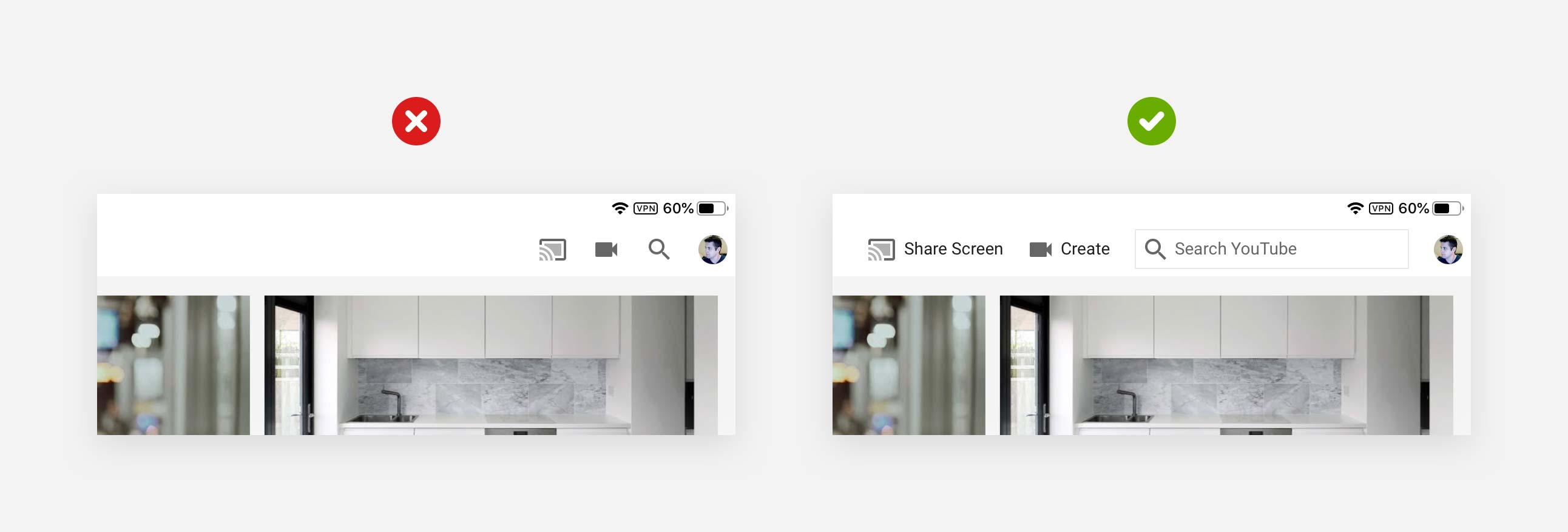
Minimalist Headers and Footers: Make sure that headers and footers are simple and do not contain too many links or options. This reduces cognitive load and allows users to focus on the content itself.
Use Case Example: A blog that discusses a variety of topics simplifies its homepage by reducing the number of categories and focusing on the most popular posts. The blog’s design is more open and includes lots of white space between articles, allowing users to easily identify featured content.
2. Streamlined Navigation
Navigation is one of the most critical aspects of any website, especially blogs with a diverse range of topics. If your navigation menu is cluttered with too many options or poorly organized, visitors will find it difficult to locate the content they’re interested in. A streamlined, intuitive navigation menu makes it easier for users to browse through your site.
-
Limit Navigation Options: Only include essential categories and pages in your navigation. A navigation bar with fewer, well-chosen options will help guide users to the right sections without overwhelming them.
-
Sticky Menus: Use sticky navigation menus that stay visible as users scroll through the page. This improves the user experience by allowing them to quickly jump to different sections of your site without scrolling back to the top.
-
Dropdown Menus: If your blog has multiple subcategories, consider using dropdown menus to keep the primary navigation bar clean. This allows users to explore content categories without cluttering the main menu.
Use Case Example: A lifestyle blog simplifies its main navigation bar to just four categories—“Home,” “Categories,” “About,” and “Contact.” The "Categories" section contains a dropdown menu with well-organized subcategories, allowing visitors to find the content they’re looking for with ease.
3. Focus on Key Content
When designing a blog, it’s important to prioritize the content that matters most. By focusing on key content areas, you can avoid overwhelming visitors with too much information and guide them toward what’s relevant to their needs.
-
Content Curation: Highlight your most popular or timely blog posts at the top of the homepage. Use large images or bold titles to make these posts stand out.
-
Avoid Autoplay: While videos and animations can be engaging, autoplay features can be disruptive and may overwhelm users. Allow visitors to decide when they want to engage with multimedia content.
-
Feature Recommendations: Based on user behavior, you can recommend content at the end of each blog post or within sidebars. However, make sure not to overcrowd the page with too many recommendations. Feature only a few highly relevant articles.
Use Case Example: A technology blog organizes its homepage to display a large section for “Trending Articles,” featuring the most popular and timely posts. The rest of the page is dedicated to the latest articles with clean, easily readable text.
4. Optimized Visuals
Visual elements, including images, videos, and infographics, play a vital role in the success of any blog. However, excessive or irrelevant images can quickly contribute to visual clutter. The key is to strike a balance between engaging visuals and a clean, streamlined layout.
-
High-Quality, Relevant Images: Use only high-quality, relevant images that enhance the content. Avoid using decorative images that do not add value to the user experience.
-
Consistent Image Sizes: Ensure that all images have consistent sizes and align well within the layout. This helps to maintain a balanced and visually appealing design.
-
Image Compression: To improve page load speed, compress images so they don’t slow down the website. Tools like TinyPNG or ImageOptim can help reduce file sizes without compromising quality.
Use Case Example: A health blog reduces the number of decorative images on the homepage, opting instead to include only relevant, high-quality images that align with the core content. Each image is carefully placed and optimized to ensure the page loads quickly.
5. Faster Loading Times
A cluttered website can often lead to slower load times due to the heavy use of images, scripts, and unnecessary elements. Slow loading times are a major contributor to high bounce rates. By simplifying your design and optimizing performance, you can ensure that your site loads faster and provides a smoother experience.
-
Minimize HTTP Requests: Reduce the number of elements on each page by simplifying the design. Fewer HTTP requests will result in faster load times.
-
Optimize Code: Clean up your HTML, CSS, and JavaScript code to eliminate unnecessary scripts and reduce file sizes.
-
Lazy Loading: Implement lazy loading for images and videos. This ensures that media content only loads when it comes into view, improving page load times.
Use Case Example: A travel blog notices a drop in user engagement due to slow load times. The site is redesigned with fewer images and optimized code, reducing load times significantly and resulting in a smoother browsing experience.
6. Mobile Optimization
A large portion of blog traffic comes from mobile users, and having a responsive design is essential for providing a great experience across devices. A mobile-optimized website reduces clutter by automatically adjusting the layout and navigation for smaller screens.
-
Responsive Design: Ensure that your site adapts to various screen sizes. Mobile users should have the same seamless experience as desktop users.
-
Touch-Friendly Elements: Make sure buttons and links are large enough to be easily tapped on mobile devices. Avoid using small buttons that are difficult to interact with.
-
Simplified Mobile Menus: Mobile users should have an easy-to-access navigation menu, usually with a hamburger-style dropdown for a compact design.
Use Case Example: A lifestyle blog optimizes its design for mobile devices by using a simple, one-column layout. The mobile navigation menu is compact and collapsible, making it easier for users to find content on smaller screens.
Conclusion: The Power of Simplicity in UX/UI Design
By focusing on simplicity in UX/UI design, blogs can greatly improve their user experience, lower bounce rates, and increase engagement. By reducing clutter, streamlining navigation, and prioritizing key content, visitors can find what they need quickly and easily. Additionally, simplifying your design leads to faster load times and a more responsive experience, which is especially important for mobile users.
The goal is to create an intuitive, pleasant experience that guides visitors naturally through your content, encourages them to explore more, and ultimately boosts your website's performance. By adopting a user-centric approach and reducing unnecessary complexity, you can enhance your blog’s success and keep visitors coming back for more.

Share

Keep me postedto follow product news, latest in technology, solutions, and updates
Related articles
Explore all