
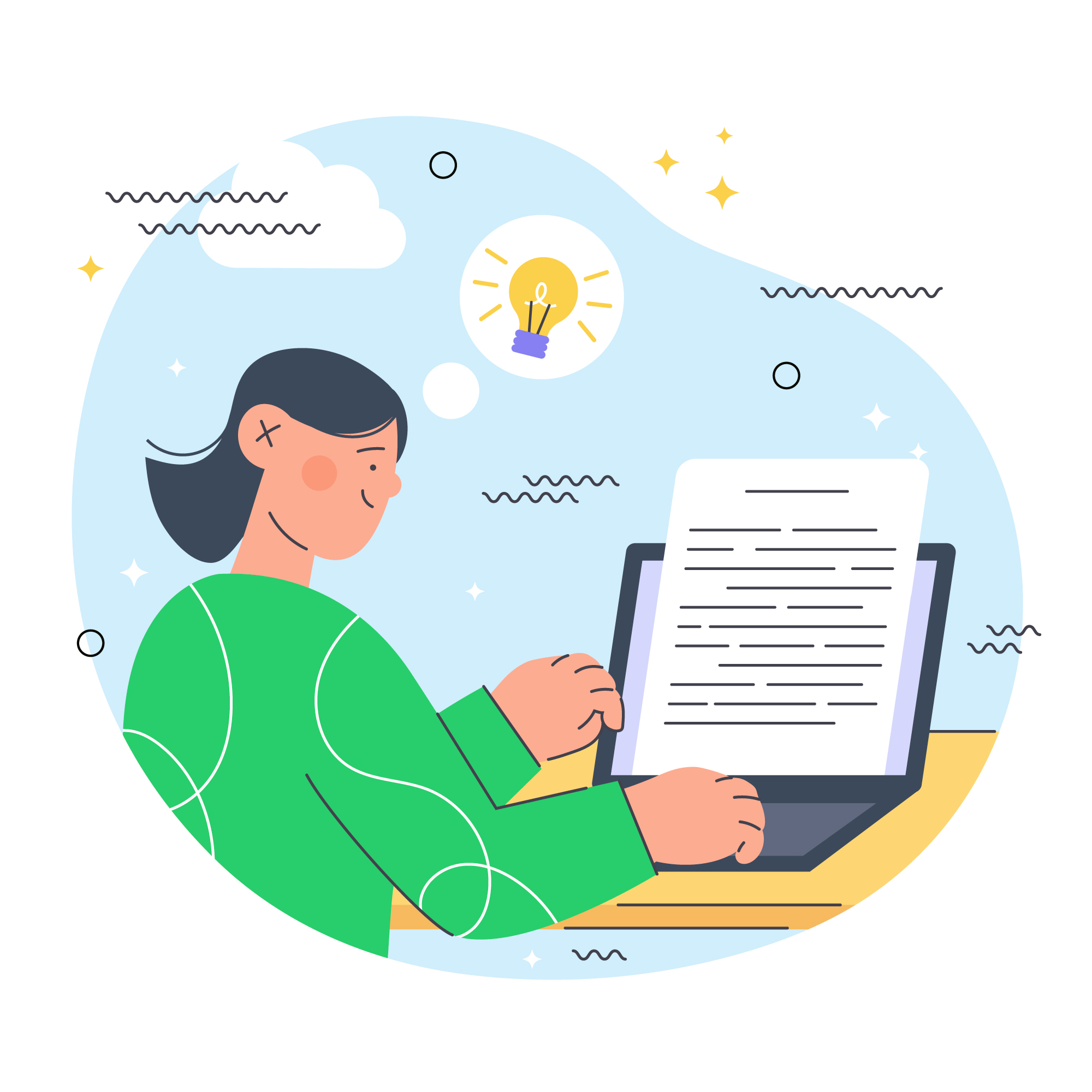
Scroll-Friendly, Skim-Ready: How to Write for Today’s Short Attention Spans

In a world where attention spans are measured in seconds and multitasking is the norm, the way we write for the web has changed dramatically. Users no longer read—they scan. They scroll quickly, looking for visual cues and quick takeaways, not long blocks of uninterrupted text.
Whether you're designing a course catalog, e-commerce site, landing page, or blog, writing scroll-friendly, skim-ready content is now an essential skill. In this article, we’ll explore how to write for the modern reader, and how one online learning platform boosted enrollments simply by reformatting its course descriptions.
The New Rules of Online Reading
1. People Don’t Read. They Scan.
Eye-tracking studies show users typically follow an “F-shaped pattern” when reading online: scanning headings and the first few words of each line.
2. Short Attention, High Expectations
With more content than ever competing for attention, users expect information to be digestible, visual, and actionable—fast.
3. Scroll Is the New Click
Users are more comfortable scrolling than clicking, but they won’t scroll endlessly without payoff. Your job is to keep them scrolling with content that feels light and engaging.
Case Study: Rewriting for Scroll Boosted Course Enrollments
An online learning platform offered high-quality professional courses but struggled with poor engagement on their course detail pages. Despite strong SEO and traffic, users weren’t signing up.
What They Discovered:
-
Course descriptions were dense, paragraph-heavy, and hard to skim
-
Key benefits were buried in text instead of highlighted
-
Mobile users found the content overwhelming
What They Did:
-
Rewrote course pages using bullet points, icons, and subheadings
-
Highlighted outcomes like “What You’ll Learn” and “Who This Is For”
-
Added visual elements like checkmarks and callouts
-
Reordered content to put the most important information first
The Result:
-
Content completion increased by 35%
-
Enrollments rose significantly in the following month
-
Time spent on course pages grew, with more users scrolling past the halfway point
What changed wasn’t the offer—but the presentation.
How to Make Your Website Content Skim-Ready
1. Use Clear Headings (and Subheadings)
Break your content into sections that tell the story at a glance. Each heading should:
-
Be meaningful on its own
-
Be short and action-oriented
-
Help users skip to what matters
Bad: “Introduction to the Program”
Better: “What This Course Covers in Week 1”
2. Write in Bullet Points, Not Blocks
Lists are easier to scan and digest—especially on mobile.
Instead of:
"This course includes downloadable templates, interactive exercises, real-world case studies, and one-on-one mentorship sessions."
Try:
What’s Included:
-
Downloadable templates
-
Real-world case studies
-
1-on-1 mentorship
-
Interactive activities
3. Front-Load Your Value
Put the most important information at the top of the page or section. This is where users decide whether to keep reading.
-
Start with benefits, not features
-
Summarize key takeaways in the first paragraph
-
Use intro blocks like “You’ll Learn How To…”
4. Add Visual Anchors
Icons, pull quotes, and callouts help guide the reader’s eye. Visuals break the monotony of text and highlight key points.
Use icons to represent:
-
Time to complete
-
Difficulty level
-
Skill required
-
User rating
5. Keep Paragraphs Short and Punchy
Limit paragraphs to 1–3 sentences. Add white space between paragraphs to reduce cognitive load and improve readability on mobile.
Mistakes to Avoid
-
Writing like a textbook or brochure
-
Using jargon without explanation
-
Making users scroll for pricing or calls to action
-
Ignoring mobile formatting
-
Burying critical information below the fold
Where This Applies on Your Website
-
Product or service pages
-
About and team pages
-
Blog posts and resource hubs
-
Contact or onboarding flows
-
Pricing pages
If it’s on your website, it should be designed to be read—or at least skimmed—on a small screen in 5 minutes or less.
The Payoff of Skim-Ready Content
Websites that communicate clearly and quickly convert better. Users don’t need more content—they need faster clarity. When you help users feel informed without feeling overwhelmed, you build trust—and increase conversions.
Conclusion: Design Words That Work Like UX
Writing for the web today means writing for speed, relevance, and flexibility. Your words should guide users through your content just as intuitively as your interface guides them through your product.
Don’t just write. Design the reading experience. Use structure, flow, and visual cues to serve the reader—and they’ll reward you with their time, attention, and action.


Subscribe to follow product news, latest in technology, solutions, and updates
Other articles for you


Let’s build digital products that are simply awesome !
We will get back to you within 24 hours!Go to contact us