Techniques for Responsive Web Design: Enhancing User Experience Across Devices

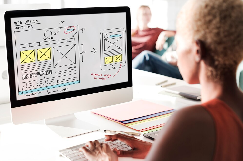
In today’s digital world, users access websites through a variety of devices, from desktops and tablets to smartphones and even smart TVs. Ensuring that a website is visually appealing and functional across all screen sizes is essential for delivering a seamless user experience. This is where Responsive Web Design (RWD) comes into play.
Responsive Web Design is a design approach that makes web pages adjust dynamically based on the user’s screen size, orientation, and platform. In this article, we will explore key techniques for implementing Responsive Web Design and how they contribute to better usability, accessibility, and performance.

1. Flexible Grid Layouts
A flexible grid is the foundation of responsive design. Instead of using fixed-width layouts, designers use relative units like percentages, em, and rem to create a fluid layout that adapts to different screen sizes.
Best Practices:
-
Use CSS Grid or Flexbox for more flexible and efficient layouts.
-
Define column widths in percentages rather than pixels to ensure proportional scaling.
-
Avoid setting fixed heights for containers to accommodate different content lengths.
2. Media Queries: Adapting to Different Screen Sizes
CSS media queries allow developers to apply different styles depending on the device’s screen size, resolution, or orientation.
Example Use Cases:
-
Change the font size and spacing for better readability on small screens.
-
Adjust navigation menus (e.g., from a horizontal bar to a collapsible mobile menu).
-
Optimize images and content placement for different breakpoints.
Common Media Query Breakpoints:
-
@media (max-width: 768px): Target tablets and smaller devices.
-
@media (max-width: 480px): Target mobile phones.
-
@media (min-width: 1024px): Target larger screens.
3. Flexible Images and Media
Using flexible images ensures that visuals resize and scale properly across different screen sizes.
Techniques:
-
Use max-width: 100% in CSS to make images adjust dynamically without overflowing.
-
Use SVG (Scalable Vector Graphics) : for logos and icons to maintain sharpness on high-resolution screens.
-
Implement CSS object: fit for background images to control how they scale and crop.
4. Mobile-First Design Approach
The mobile-first approach prioritizes designing for smaller screens first and then progressively enhancing the layout for larger screens.
Why Mobile-First?
-
Improves performance by focusing on essential content first.
-
Enhances usability for touch-based interactions.
-
Ensures progressive enhancement, making it easier to scale up.
Implementation Tips:
-
Start with a simple layout optimized for mobile.
-
Gradually add complexity and new features as the screen size increases.
-
Prioritize touch-friendly elements (e.g., larger buttons and tap targets).
5. Responsive Navigation
Navigation menus can be challenging to design responsively. Using adaptable navigation techniques ensures a smooth user experience.
Responsive Navigation Options:
-
Hamburger Menu: A common approach where a menu button expands into a dropdown.
-
Sticky Navigation: Keeps the menu accessible as users scroll.
-
Collapsible Menus: Sections expand/collapse based on user interaction.
6. Optimized Typography for Readability
Typography plays a crucial role in usability. Adjusting text sizes and spacing ensures content remains readable on all devices.
Best Practices:
-
Use relative units like em or rem instead of fixed px values.
-
Ensure adequate line spacing (line-height) for better readability.
-
Limit paragraph width to 45–75 characters per line to enhance readability.
7. Performance Optimization for Faster Loading
A responsive website must also be fast to load, as slow pages lead to poor user experience and higher bounce rates.
Optimization Techniques:
-
Lazy Loading: Load images and content only when needed.
-
Minify CSS and JavaScript: Reduce file sizes to improve loading speed.
-
Use Content Delivery Networks (CDNs): Improve global accessibility and reduce latency.
8. Testing and Debugging Responsive Designs
Testing across multiple devices and screen sizes ensures that the design works as expected.
Tools for Testing:
-
Google Mobile-Friendly Test – Checks if your site is mobile-friendly.
-
Chrome DevTools (Responsive Mode) – Simulates different screen sizes.
-
BrowserStack or LambdaTest – Tests on real devices and browsers.
Conclusion
Responsive Web Design is no longer optional—it is essential for delivering a consistent and enjoyable user experience across devices. By implementing techniques such as flexible grids, media queries, and optimized typography, developers can create websites that adapt seamlessly to any screen size.
With the growing diversity of devices, adopting responsive design principles ensures better engagement, accessibility, and long-term usability. Whether you're redesigning an existing site or building from scratch, applying these techniques will help create a future-proof digital experience.


Subscribe to follow product news, latest in technology, solutions, and updates
Other articles for you


Let’s build digital products that are simply awesome !
We will get back to you within 24 hours!Go to contact us Please tell us your ideas.


