
How Dark Mode and Customization Improve User Experience
User experience (UX) is at the heart of modern digital design, and dark mode and UI customization have become essential features in many applications and websites. These functionalities enhance readability, reduce eye strain, and provide users with a more comfortable browsing experience, especially during prolonged usage.
Customization options, such as adjustable themes, font sizes, and UI layouts, further personalize the experience, allowing users to interact with digital products in ways that best suit their preferences.
This article explores how dark mode and customization improve UX, the key benefits they offer, and how a social media platform introduced these features, resulting in a 20% increase in user session duration.
The Growing Popularity of Dark Mode and Customization
Dark mode and UI customization have become mainstream due to user demand and scientific research on digital ergonomics. Leading operating systems, web applications, and mobile apps have integrated these features, allowing users to tailor their digital experience to their preferences.
Dark Mode in UX/UI
Dark mode replaces the traditional light background with a dark color scheme, reducing the amount of light emitted by screens while maintaining contrast for readability.
UI Customization Features
Customization allows users to modify elements of an interface, including:
-
Theme selection (light mode, dark mode, high-contrast mode)
-
Font and text size adjustments
-
Color palette personalization
-
Layout and navigation customization
By integrating these features, digital platforms can accommodate different user needs and increase engagement.
Why Dark Mode and Customization Matter in UX/UI
1. Reduces Eye Strain and Improves Readability
One of the main reasons users prefer dark mode is because it reduces eye strain, especially in low-light environments. Bright white backgrounds can cause discomfort over extended periods, whereas darker backgrounds help:
-
Reduce blue light exposure, which is linked to eye fatigue.
-
Minimize glare, improving readability in dim settings.
-
Enhance contrast for text and visuals, especially for users with light sensitivity.
Example: A productivity app introduced dark mode, and user feedback showed a 15% reduction in reports of eye fatigue, leading to higher retention rates.
2. Enhances User Engagement and Retention
Giving users control over their UI experience makes them more comfortable and engaged. When users personalize their interface, they tend to stay on platforms longer because the experience feels tailored to their needs.
Example: A news website allowed users to adjust font size and background color, leading to a 12% increase in article completion rates, as users found reading more comfortable.
3. Improves Battery Life on OLED Screens
For mobile devices with OLED or AMOLED screens, dark mode reduces battery consumption by turning off unused pixels. This results in:
-
Longer battery life, improving mobile usability.
-
Better performance, as lower brightness levels consume less power.
Example: A mobile messaging app reported a 20% decrease in battery usage among users who switched to dark mode, leading to improved user satisfaction.
4. Accommodates Users with Visual Sensitivities
Dark mode and high-contrast modes benefit users with visual impairments, dyslexia, and light sensitivity. Providing adjustable brightness and contrast settings ensures a more inclusive experience.
Example: A university learning platform introduced color contrast settings for visually impaired students, leading to a 30% increase in accessibility tool adoption.
5. Strengthens Brand Identity and User Preference
Allowing users to choose their own UI theme fosters a sense of ownership and personalization, making them feel more connected to the platform. Customization also helps:
-
Maintain brand consistency while offering flexibility.
-
Encourage user loyalty, as personalized experiences feel unique.
-
Provide a competitive edge, as users are drawn to platforms that prioritize UX flexibility.
Example: A tech forum allowed users to create custom themes, leading to a 10% increase in daily active users.
Use Case: How a Social Media Platform Increased User Session Duration by 20% with Dark Mode and Custom Themes
The Problem: High User Drop-Off Due to UI Fatigue
A social media platform observed a decline in session duration among users who engaged with the app for long periods. User feedback revealed:
-
Bright backgrounds caused eye strain, leading to shorter browsing sessions.
-
Limited customization options made the interface feel generic.
-
Users preferred a more personalized UI experience, but the app lacked theme adjustments.
These issues resulted in higher bounce rates and reduced time spent per session.
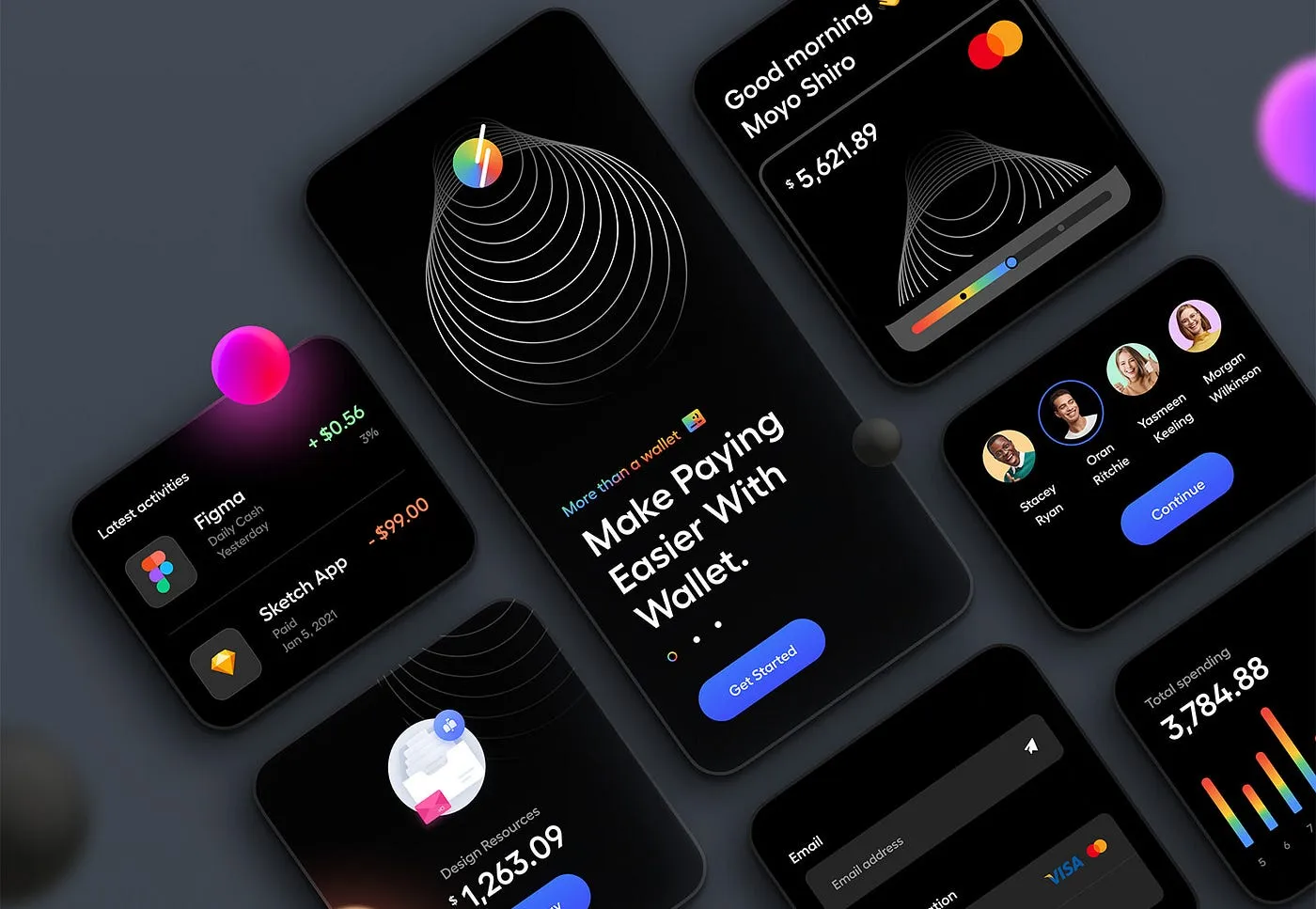
The Solution: Introducing Dark Mode and Custom UI Themes
To address these challenges, the platform introduced:
-
Dark Mode Toggle
-
Users could switch between light and dark mode based on their preferences.
-
A system-based auto-switching option allowed dark mode activation based on time of day.
-
Customizable UI Themes
-
Users could choose from pre-set themes (e.g., high-contrast, blue-light reduction).
-
Additional personalization, including adjustable font sizes and background colors, was introduced.
-
Battery Optimization for Mobile Users
-
The app implemented power-efficient display settings for OLED screens.
The Results: Higher Engagement and Retention
After rolling out dark mode and customization options, the platform saw:
-
20% increase in user session duration, as users were more comfortable browsing for extended periods.
-
30% decrease in user complaints about eye strain, improving overall satisfaction.
-
Higher adoption rates among night-time users, with over 60% of users enabling dark mode.
These findings demonstrated that providing UI flexibility improves user retention and experience.
How to Implement Dark Mode and UI Customization in UX/UI Design
To successfully integrate dark mode and UI personalization, consider the following best practices:
1. Provide an Easy Toggle Between Light and Dark Mode
-
Allow users to switch instantly between themes.
-
Offer system-based auto-adjustment to match device settings.
2. Use Adaptive UI Design for Better Contrast
-
Ensure text remains legible in both dark and light themes.
-
Use WCAG-compliant color contrast for accessibility.
3. Enable Customization for Fonts, Colors, and Layouts
-
Let users adjust text size, background brightness, and contrast settings.
-
Provide multiple pre-set themes for quick customization.
4. Optimize for Performance and Battery Efficiency
-
Ensure dark mode reduces power consumption on mobile OLED displays.
-
Test for smooth transitions between modes.
5. Conduct User Testing to Refine Experience
-
Gather feedback from real users to optimize dark mode usability.
-
A/B test different color schemes and UI configurations.
Conclusion
Dark mode and UI customization are more than just aesthetic choices—they enhance usability, improve engagement, and create a more personalized experience.
The case study of a social media platform increasing session duration by 20% highlights the value of offering dark mode and user-customizable themes. By reducing eye strain, increasing battery efficiency, and catering to user preferences, these features can significantly improve retention and user satisfaction.
As digital interfaces evolve, providing users with control over their visual experience will become an essential aspect of modern UX/UI design. Businesses and developers who prioritize these elements will stand out in a competitive digital landscape, delivering experiences that are comfortable, engaging, and tailored to individual needs.


Subscribe to follow product news, latest in technology, solutions, and updates
Other articles for you


Let’s build digital products that are simply awesome !
We will get back to you within 24 hours!Go to contact us Please tell us your ideas.


 28/11 Soi Ruamrudee, Lumphini, Pathumwan, Bangkok 10330+66 62 389 4599hello@sennalabs.com© 2022 Senna Labs Co., Ltd.All rights reserved.