UX/UI in Government & Public Service Websites: Enhancing Usability for Citizens
Share
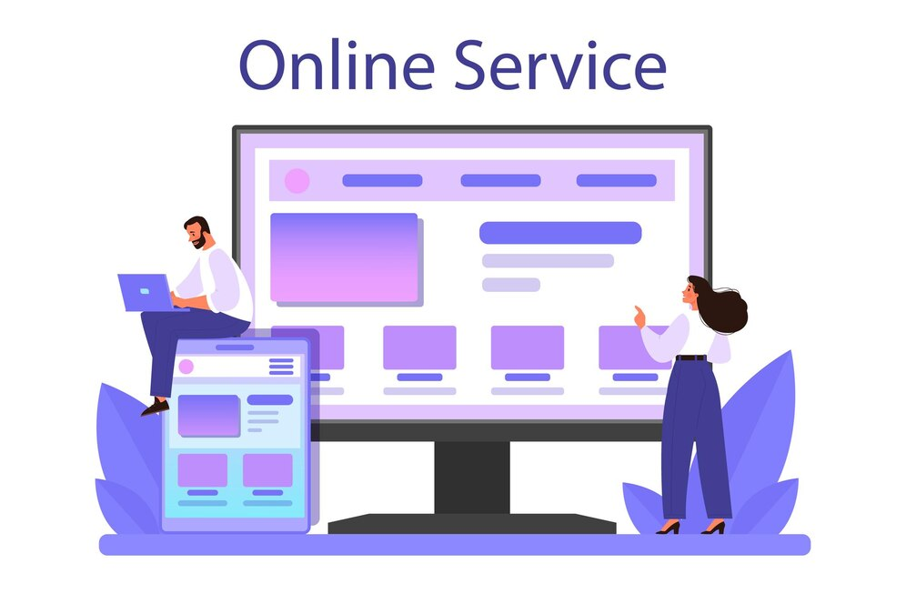
Government and public service websites play a crucial role in providing citizens with essential information, services, and resources. Whether applying for benefits, renewing a passport, or accessing healthcare services, users rely on these platforms to navigate complex bureaucratic systems. However, poor UX/UI design can lead to frustration, inefficiency, and lack of accessibility for diverse populations.
To ensure that government websites are user-friendly and inclusive, a well-structured User Experience (UX) and User Interface (UI) design must prioritize accessibility, clear navigation, and ease of use for all demographics. This article explores how UX improves government service accessibility, how inclusive design ensures usability for diverse users, and how structured navigation reduces frustration.
The Role of UX in Making Government Services More Accessible
Government websites must cater to a wide audience, including citizens with disabilities, non-English speakers, elderly users, and those with limited digital literacy. A poorly designed website can make essential services difficult to access, causing frustration and inefficiencies.
1. Why Accessibility is Critical in Government Websites
Unlike commercial platforms, government websites must serve all citizens equally, regardless of their abilities or technological proficiency. Barriers to accessibility can lead to:
-
Delays in accessing essential services like healthcare, unemployment benefits, and social security.
-
Exclusion of users with disabilities who rely on assistive technologies.
-
Increased support requests, straining government resources.
2. UX Strategies for Improving Accessibility in Public Service Websites
a) Mobile-Optimized Design for Wide Accessibility
-
Ensure websites are fully responsive for use on mobile devices.
-
Use touch-friendly buttons and layouts for easy navigation.
-
Optimize for low-bandwidth connections to serve users in remote areas.
b) Readability and Language Accessibility
-
Use plain language to simplify legal and technical terms.
-
Offer multilingual support, with easy language selection.
-
Implement text resizing options for users with vision impairments.
c) Compatibility with Assistive Technologies
-
Ensure compatibility with screen readers for visually impaired users.
-
Use keyboard navigability for users who cannot use a mouse.
-
Provide audio descriptions and subtitles for video content.
3. The Impact of UX on Government Service Accessibility
When government websites prioritize accessibility:
-
More citizens can independently complete tasks without assistance.
-
Government agencies reduce support requests, leading to cost savings.
-
Users experience less frustration and greater trust in public services.
By focusing on inclusive UX design, public service websites can become efficient, user-friendly, and accessible to all citizens.
How Inclusive Design Ensures Usability for All Demographics
Government websites serve a diverse audience, including individuals with different educational backgrounds, disabilities, languages, and internet access levels. Inclusive design ensures that no user is left behind.
1. What is Inclusive UX/UI Design?
Inclusive design focuses on creating digital experiences that accommodate everyone, rather than catering to a narrow audience. It ensures that people of all abilities, ages, and backgrounds can successfully use a website.
2. Best Practices for Inclusive Government UX/UI
a) User-Centric Design Based on Real Needs
-
Conduct usability testing with diverse groups, including seniors, disabled users, and non-tech-savvy individuals.
-
Use real-life scenarios to identify pain points and improve workflows.
-
Offer alternative formats for important documents (e.g., audio, Braille-ready PDFs).
b) Clear and Simple User Interfaces
-
Avoid cluttered pages—use clear headings and well-spaced text.
-
Provide step-by-step guides for complex processes.
-
Include visual indicators (icons, color coding) to enhance understanding.
c) Forms and Online Applications Designed for Simplicity
-
Reduce the number of required fields in online forms.
-
Use pre-filled information where possible to speed up completion.
-
Provide real-time validation and error messages to prevent user mistakes.
3. The Impact of Inclusive Design on Citizen Engagement
Government websites with strong inclusive UX/UI:
-
Improve trust and engagement by making services accessible to all.
-
Reduce frustration for marginalized or underrepresented groups.
-
Increase service completion rates, as users can navigate tasks independently.
By integrating inclusive design principles, government websites can truly serve their entire population effectively.
The Impact of Structured Navigation in Reducing User Frustration
Many government websites suffer from information overload, poor organization, and confusing navigation structures, leading to high drop-off rates and user frustration. A well-structured navigation system helps users find relevant information quickly.
1. Why Structured Navigation is Essential for Public Service Websites
Government websites often contain hundreds of pages with information on various programs, policies, and services. Without a clear navigation structure, users may struggle to:
-
Locate specific forms or application portals.
-
Understand eligibility requirements for government services.
-
Find contact information for relevant departments.
2. Best Navigation Strategies for Government UX/UI
a) Logical Information Hierarchy and Categorization
-
Organize content into clear, high-level categories (e.g., Healthcare, Taxes, Employment).
-
Use breadcrumb navigation so users always know where they are.
-
Provide a “Top Services” section for frequently accessed pages.
b) Search Functionality with Smart Suggestions
-
Offer an AI-powered search bar that suggests relevant pages.
-
Use filters and keyword tags to refine search results.
-
Ensure searches accommodate common misspellings or synonyms.
c) Well-Designed Homepage and Landing Pages
-
Keep the homepage simple and focused on essential services.
-
Use visual cues (icons, color blocks) to direct users.
-
Ensure that important alerts (e.g., emergency updates) are prominently displayed.
3. The Impact of Structured Navigation on User Experience
A well-organized government website:
-
Reduces time spent searching for information, leading to higher service completion rates.
-
Minimizes support calls and inquiries, saving government resources.
-
Improves citizen satisfaction and trust in government efficiency.
By prioritizing structured navigation and intuitive layouts, public service websites can become more user-friendly and effective.
Best UX/UI Practices for Government & Public Service Websites
To ensure a seamless experience for all citizens, government websites should implement these UX/UI best practices:
-
Prioritize Accessibility and Inclusivity
-
Ensure mobile compatibility and screen reader support.
-
Offer multilingual content and plain-language explanations.
-
Implement keyboard-friendly navigation.
-
Simplify Navigation and Content Structure
-
Organize information into clear, logical categories.
-
Provide smart search functionality.
-
Use visual elements (icons, progress indicators) to aid navigation.
-
Streamline Forms and Applications
-
Minimize required fields and redundant steps.
-
Provide auto-save and pre-filled fields.
-
Offer alternative submission options for users without digital access.
-
Ensure Security and Transparency
-
Use trust signals, such as government seals and SSL encryption.
-
Clearly communicate privacy policies and data protection measures.
-
Provide status updates and confirmation emails for applications.
-
Optimize for Performance and Mobile Access
-
Ensure fast-loading pages with optimized images and code.
-
Allow users to access services on all devices, including low-bandwidth networks.
-
Provide offline access to critical resources when possible.
Conclusion
A well-designed government or public service website is more than just an online portal—it is a lifeline for citizens seeking critical services. By prioritizing accessibility, inclusivity, and structured navigation, government agencies can enhance citizen engagement, reduce frustration, and improve service efficiency.
With strong UX/UI design, government websites can become a powerful tool for public service, ensuring equal access to information and resources for all individuals, regardless of their abilities or technological proficiency.

Share

Keep me postedto follow product news, latest in technology, solutions, and updates
Related articles
Explore all


