UX/UI for Non-Tech Users: Making Websites and Apps Easy to Navigate
Share

In today’s digital world, it’s easy to assume that all users are familiar with technology and can navigate complex websites and applications without a hitch. However, this is far from the truth for many people, especially those in older age groups or those who may not be as tech-savvy. For organizations like community centers, whose services cater to a wide range of users, focusing on user experience (UX) and user interface (UI) design becomes essential to ensuring that all visitors can easily interact with their site, regardless of their technological background.
In this article, we’ll explore how focusing on usability in UX/UI design can help make websites and apps more accessible and easier to navigate for non-tech users. We’ll provide insights into key design principles that can make a significant difference for older adults, families, or any audience that may struggle with complex online interfaces.
Why Accessibility and Usability Matter for Non-Tech Users
When it comes to websites and apps aimed at non-tech users, the goal is to simplify the digital experience and make it intuitive for people with varying levels of digital literacy. In the case of a local community center, for example, many visitors may be older adults who want to sign up for events, but who might feel overwhelmed by confusing interfaces or complex processes. A poor experience may discourage them from engaging, resulting in missed opportunities for both the users and the organization.
By making websites and apps easier to navigate, community centers, businesses, and organizations can ensure better participation, improve accessibility, and build stronger relationships with their audience. But how exactly can they achieve this?
Key UX/UI Design Principles for Non-Tech Users
-
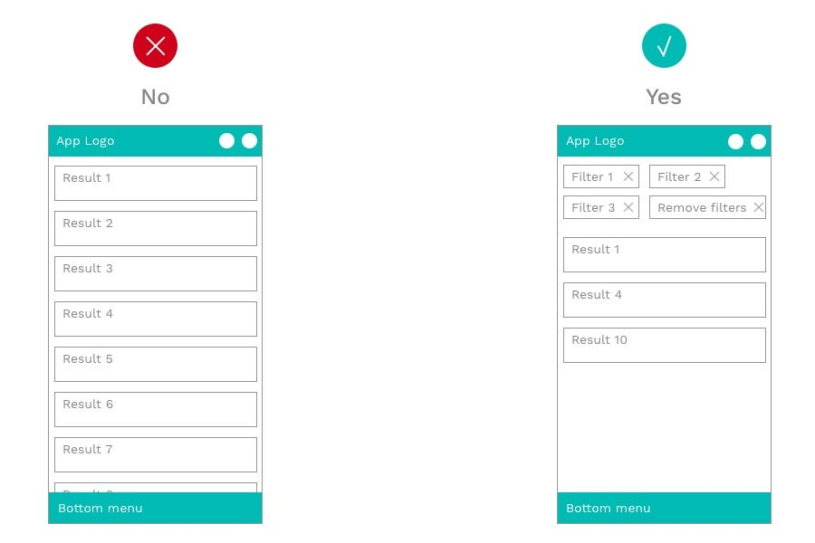
Clear and Simple Navigation
For non-tech-savvy users, navigation should be as simple as possible. Complex menus or too many choices can confuse users, especially older adults who may not be accustomed to intricate navigation systems. A clean, straightforward navigation bar is essential.
-
Use Descriptive Labels: Avoid using jargon or ambiguous terms. Use clear labels like “Sign Up for Events” instead of “Register” or “Join.” Simplicity is key.
-
Limit the Number of Choices: Keep menu items to a minimum, and organize content logically. For instance, group related items like “Upcoming Events” and “Past Events” under the same category to reduce clutter.
-
Sticky Navigation: Make it easier for users to move around by using a sticky navigation bar that remains visible as they scroll down the page, so they don’t need to keep scrolling back to the top.
Use Case Example: A local community center website redesigns its event sign-up page by having a clearly visible “Register” button at the top of the homepage. The button stays fixed in place while users scroll, allowing easy access from anywhere on the site.
-
Simplified Forms and Processes
Filling out forms can be one of the most frustrating aspects for non-tech users, especially if the process involves too many steps or complicated instructions. In a community center context, this could include signing up for events, submitting payment, or providing contact details.
-
Short Forms: Keep forms short and ask for only the essential information. Don’t overwhelm users with long, detailed forms.
-
Use Step-by-Step Guidance: If the form requires multiple steps, break them up into digestible chunks. Show users how far along they are and what’s coming next.
-
Inline Validation: Provide immediate feedback while users fill out the form to let them know if they’re missing something or if there’s an error (e.g., “Please enter a valid email address”).
-
Auto-Fill Options: Enable auto-fill where possible to save time for users, especially for information like name, address, or phone number.
Use Case Example: The community center simplifies its event registration form to just a few fields, such as name, email, and phone number. A progress bar guides users through the process, and all required fields are marked with asterisks to avoid confusion.
-
Larger, Easy-to-Read Fonts
For older adults or those with visual impairments, readability is critical. Small fonts, light text on a dark background, or busy typography can make it difficult for users to read and engage with the content.
-
Use Large, Clear Fonts: Ensure that fonts are legible and large enough for older users. Sans-serif fonts, like Arial or Helvetica, are easier to read on screens than serif fonts.
-
High Contrast: Ensure good contrast between text and background. Dark text on a light background is typically easier to read.
-
Text Resizing: Allow users to adjust the text size if needed, especially for those with visual impairments.
Use Case Example: The community center adjusts its website’s fonts to make them larger and more legible, ensuring the text is easy to read on mobile devices as well as desktop screens. Additionally, a high contrast color scheme is implemented to improve readability.
-
Intuitive Visual Design
Visual design plays an important role in guiding users through a website or app. A clean, visually intuitive interface helps users feel more comfortable and confident as they interact with a site.
-
Clear Call-to-Action Buttons: Buttons should be large, easy to find, and have clear labels that describe the action. Instead of a generic “Submit” button, use specific calls-to-action like “Register Now” or “Sign Up for This Event.”
-
Visual Hierarchy: Use design elements like size, color, and placement to prioritize the most important information. For example, the main action button should be the most prominent feature on a page.
-
Icons and Imagery: Use icons and images to complement the text and guide users visually. For example, a calendar icon next to an event sign-up link helps users quickly identify the action.
Use Case Example: The community center redesigns its homepage to feature prominent icons for different event categories, such as “Classes,” “Workshops,” and “Volunteer Opportunities.” Each section has a bold “Register” button, making it easy for users to quickly sign up.
-
Mobile Optimization
With an increasing number of users accessing websites through their smartphones, it’s important to ensure that the site is mobile-friendly. Non-tech users, especially older individuals, may not always use desktop devices, so providing an excellent mobile experience is crucial.
-
Responsive Design: Ensure that your website automatically adjusts to fit various screen sizes. This makes it easier for users to access information no matter what device they use.
-
Touch-Friendly Elements: Buttons and links should be large enough to be easily tapped on mobile devices. Make sure users don’t have to zoom in to click on a button or select a menu item.
-
Simple Mobile Navigation: Mobile menus should be easy to navigate and provide a smooth experience with minimal clicks.
Use Case Example: The community center ensures that its event registration system is mobile-friendly, allowing users to easily sign up for events via their smartphones. A simple, single-column layout helps avoid clutter, and large buttons make the registration process seamless.
6.Provide Clear Error Messages and Help
Non-tech users often need additional guidance when they encounter issues. If something goes wrong on the website, clear, helpful error messages can reduce frustration and guide them to the next step.
-
Be Specific: Error messages should be clear and specific, such as “Please enter a valid email address” or “This field is required.”
-
Offer Solutions: Whenever possible, provide solutions or steps for resolving the issue. For example, a “Contact Us” link can direct users to customer support if they need help.
-
Easy Access to Support: Include an easily accessible help section or a contact form where users can ask questions or request assistance.
Use Case Example: When a user attempts to sign up for an event but leaves a required field blank, the community center’s site displays a clear error message stating which field needs to be filled in, along with an option to contact support if further assistance is required.
Conclusion
Designing websites and apps that are easy to navigate and cater to non-tech-savvy users is essential for organizations like community centers. By following principles of simplicity, clarity, and accessibility, businesses can ensure that all users—regardless of their age or tech experience—can easily interact with their website, sign up for events, and access important information.
By focusing on usability in UX/UI design, you not only make your website more accessible but also increase engagement, build trust, and ensure that your services reach a broader audience. Simplifying digital experiences ensures everyone, from younger, tech-savvy users to older adults, can comfortably participate and enjoy all the benefits your website has to offer.

Share

Keep me postedto follow product news, latest in technology, solutions, and updates
Related articles
Explore all