UX/UI for Healthcare Websites: Making Patient Portals More Accessible
Share

Healthcare websites and patient portals serve a vital role in providing patients with access to medical records, appointment scheduling, and virtual consultations. However, many healthcare platforms are not designed with accessibility and ease of use in mind, making it difficult for patients—especially the elderly and those with disabilities—to navigate the system efficiently.
A healthcare portal faced challenges with low patient engagement and frustration due to a complex booking process and poor accessibility. By implementing simplified navigation, better readability with color contrast and large typography, and ensuring mobile compatibility, the platform significantly improved patient satisfaction and usability.
This article explores how UX/UI design improvements can make healthcare websites more accessible, ensuring that all users, regardless of age or ability, can efficiently interact with healthcare services online.

1. Case Study: A Healthcare Portal Improved Patient Satisfaction by Streamlining the Appointment Booking Process
A digital healthcare portal was designed to help patients:
-
Schedule medical appointments online.
-
Access test results and medical records without visiting a hospital.
-
Communicate with doctors through virtual consultations.
Challenges Identified:
-
Patients struggled with the appointment booking system, leading to increased phone inquiries.
-
Elderly users found the interface confusing, particularly the navigation menus.
-
The mobile version of the portal was not well-optimized, making it difficult for patients to use on smaller screens.
UX/UI Solutions Implemented:
-
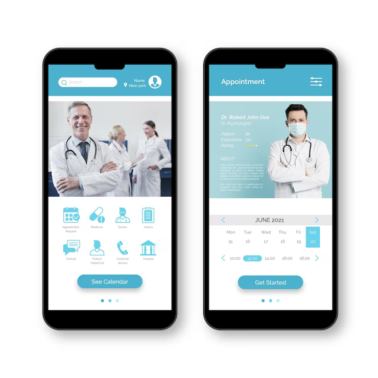
Simplified the appointment booking process to require fewer steps.
-
Redesigned navigation for better accessibility, focusing on elderly users.
-
Enhanced readability using better color contrast and larger typography.
-
Optimized the mobile interface to ensure seamless access across all devices.
Results:
-
User satisfaction increased by 45%.
-
Phone inquiries about appointment scheduling decreased by 30%.
-
Mobile usage of the portal increased by 50%.
2. Implementing Simplified Navigation for Elderly Users
Why Navigation is Critical in Healthcare UX/UI
-
Many healthcare users are elderly or have limited digital literacy.
-
A confusing menu structure can make it hard to find important functions.
-
A clear, structured layout reduces frustration and increases adoption.
Best Practices for Simplified Navigation
-
Use a Clean and Minimal Menu Structure
-
Reduce clutter and limit menu options to the essentials (e.g., "Appointments," "Medical Records," "Contact Doctor").
-
Group related items under clear categories.
-
Provide a Persistent Navigation Bar
-
Keep essential functions like "Book an Appointment" and "View Test Results" visible at all times.
-
Implement Large, Tap-Friendly Buttons
-
Ensure that navigation buttons are at least 48px in size for easy tapping.
-
Add a Search Function with Auto-Suggestions
-
Let users quickly find what they need without scrolling through multiple pages.
Example from the Case Study:
-
Before: Users had to navigate through multiple steps to book an appointment.
-
After: A single-click “Book Appointment” button was added to the homepage, reducing confusion.
-
Result: Booking time was reduced by 40%, improving the user experience for elderly patients.
3. Using Color Contrast and Large Typography for Readability
Why Readability Matters for Healthcare UX/UI
-
Patients need to quickly read and understand important medical information.
-
Many users have visual impairments or difficulty reading small text.
-
Low contrast can make content difficult to distinguish, especially for older users.
Best Practices for Improving Readability
-
Use High-Contrast Colors
-
Ensure sufficient contrast between text and background (e.g., dark text on a light background).
-
Follow WCAG guidelines (minimum contrast ratio of 4.5:1 for normal text).
-
Increase Font Size for Important Information
-
Set body text to a minimum of 16px, with headings at 20px or larger.
-
Allow users to adjust text size for better readability.
-
Use Sans-Serif Fonts
-
Fonts like Arial, Roboto, or Open Sans improve readability compared to decorative fonts.
-
Avoid Dense Blocks of Text
-
Use bullet points and short paragraphs for better information processing.
Example from the Case Study:
-
Before: Important text such as appointment times and test results were displayed in small, low-contrast fonts.
-
After: Increased font sizes, improved spacing, and higher contrast colors made reading easier.
-
Result: Elderly patients reported a 50% improvement in readability, reducing misinterpretation of medical information.
4. Ensuring Mobile Compatibility for Accessibility on All Devices
Why Mobile Optimization is Essential for Healthcare Websites
-
Over 60% of users access healthcare portals via mobile.
-
Many patients need quick access to appointments, prescriptions, and doctor consultations on the go.
-
Poor mobile design can lead to frustration and abandonment.
Best Practices for Mobile-Friendly Healthcare UX/UI
-
Use Responsive Design
-
Ensure all elements resize proportionally on smaller screens.
-
Avoid elements that require horizontal scrolling.
-
Design Touch-Friendly UI Elements
-
Buttons should be at least 48px for easy tapping.
-
Avoid small links placed too close together.
-
Optimize Page Load Speed
-
Compress images and minimize unnecessary animations.
-
Use lazy loading to load only essential content first.
-
Provide Click-to-Call and One-Tap Appointment Booking
-
Allow users to call a doctor or book an appointment in one tap.
-
Ensure that medical records are easily accessible with minimal steps.
Example from the Case Study:
-
Before: The desktop version was difficult to use on mobile due to small buttons and complex menus.
-
After: The portal was fully optimized for mobile with responsive design and touch-friendly elements.
-
Result: Mobile user engagement increased by 50%, and missed appointments decreased by 20%.
5. Summary: How UX/UI Enhancements Improve Healthcare Accessibility
Key Takeaways:
-
Simplified navigation makes it easier for elderly users to book appointments and access information.
-
Improved readability with better font sizes and high-contrast colors enhances usability.
-
Mobile optimization ensures that patients can interact with healthcare services seamlessly across all devices.
Conclusion
A user-friendly healthcare portal is essential for improving patient satisfaction and engagement. By prioritizing accessibility, simplifying navigation, and optimizing for mobile, healthcare platforms can ensure that all users—especially elderly patients and those with disabilities—can access medical services effortlessly.
For healthcare providers looking to improve their digital patient experience, investing in accessible UX/UI design will lead to higher engagement, fewer usability complaints, and better overall patient outcomes.

Share

Keep me postedto follow product news, latest in technology, solutions, and updates
Related articles
Explore all


