User-Centered Design in Action: Improving Healthcare Websites with Simple UX/UI
Share

In the healthcare sector, patient satisfaction is closely linked to the efficiency and ease with which they can interact with a provider's website. Whether it’s booking an appointment, accessing medical records, or finding relevant health information, a website that offers a seamless and intuitive user experience (UX) is crucial. When a healthcare provider’s website is difficult to navigate or the appointment booking process is cumbersome, it leads to frustration, increased bounce rates, and potentially lost patients. This is where User-Centered Design (UCD)—focusing on the needs, wants, and limitations of the users—becomes essential in creating a positive online experience.
In this article, we will explore how simplifying the UX/UI design of a healthcare website can improve patient satisfaction, enhance engagement, and ultimately contribute to the overall success of the provider's digital presence. We’ll use a practical use case of a healthcare provider that sought to improve its website’s user experience by simplifying navigation and the appointment booking process.
The Importance of Simple UX/UI in Healthcare Websites
Healthcare websites often have complex structures and serve many functions. They might need to house a variety of services, from appointment scheduling and patient portals to informational resources on treatments and health conditions. However, these multifaceted websites can become overwhelming for patients, especially those who may not be tech-savvy or have accessibility needs.
For a healthcare website, a good user experience isn't just about aesthetics—it's about making healthcare access easier, more intuitive, and less stressful for patients. Poor navigation, long load times, unclear appointment systems, and overly complicated interfaces can prevent patients from finding essential information or completing important tasks, such as scheduling an appointment.
Use Case: Healthcare Provider Struggling with Complex Website Navigation
Imagine a healthcare provider running a clinic with several specialists. The clinic’s website has all the right information, but users constantly provide feedback about the difficulty of navigating the site. Patients report that it takes too long to find the right doctor or schedule an appointment. The appointment booking process is convoluted, requiring multiple steps and asking for unnecessary information. As a result, many patients abandon the site before completing their task.
This provider is receiving valuable feedback about the need for a more straightforward, user-friendly website. They decide to use User-Centered Design principles to simplify the design and improve the overall experience. The goal is to make it easier for patients to find information, book appointments, and engage with the website without unnecessary hassle.
Key UX/UI Changes to Simplify Healthcare Websites
-
Streamlining Navigation One of the most common pain points on healthcare websites is navigation. With many services, departments, and specialties to cover, websites often end up cluttered with menus that overwhelm users. To address this, the healthcare provider decided to streamline the website’s navigation by focusing on the most important actions patients need to take.
Solution: The navigation menu was simplified by grouping similar content together and reducing the number of categories. For example, the website grouped "Find a Doctor," "Book an Appointment," and "Patient Portal" under clear, distinct headings. The primary call-to-action buttons, such as "Schedule Appointment" and "Find a Doctor," were made more prominent and easily accessible from the homepage.
Result: Patients could now quickly locate the information they needed without getting lost in a sea of unrelated pages. Simplified navigation helped users reach their destinations faster, reducing frustration and improving engagement. -
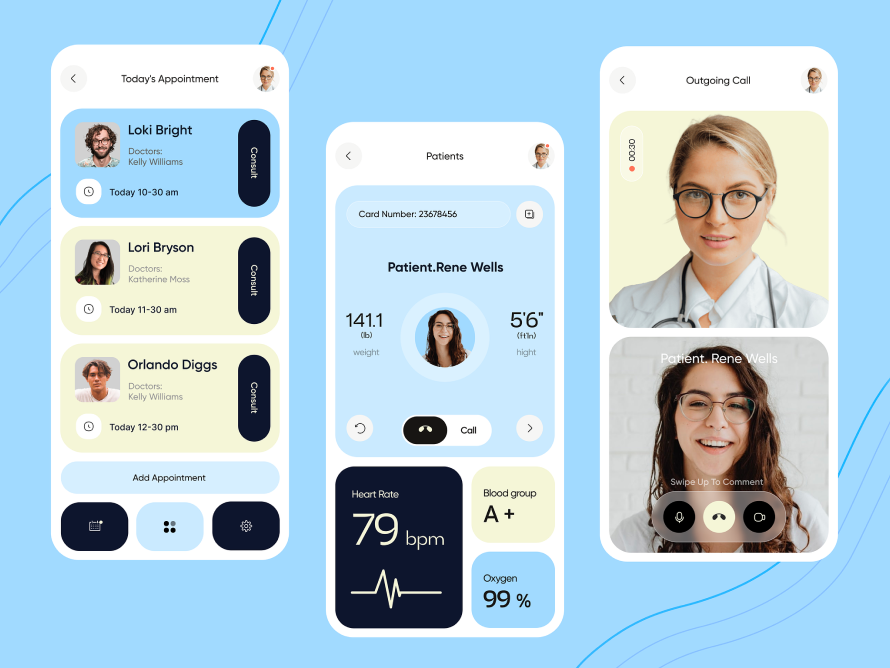
Simplifying the Appointment Booking Process Booking an appointment on a healthcare website can often be a complicated task. Multiple form fields, unnecessary steps, and redundant requests for information can make patients abandon the process. The healthcare provider needed a way to simplify this experience, making it easier for patients to book appointments, especially for those with time-sensitive needs.
Solution: The appointment booking process was redesigned to reduce friction. The clinic implemented a single-page form where patients could quickly select their doctor, choose a date and time, and submit their information. Unnecessary steps were removed, such as additional forms asking for redundant contact details or excessive medical history. A calendar view was integrated to allow patients to visually select an appointment slot, making the process more intuitive.
Result: The simpler, more straightforward booking system improved the appointment completion rate, as patients found it easier and faster to secure their appointments. This led to fewer drop-offs and more conversions for the clinic. -
Optimizing for Mobile Devices Many patients access healthcare websites from mobile devices. However, many healthcare websites are not fully optimized for mobile use, resulting in difficult-to-read text, misaligned images, and broken links. A mobile-optimized website ensures that users on smartphones and tablets have a smooth, frustration-free experience.
Solution: The healthcare provider adopted a responsive design approach, ensuring that the website automatically adjusted to fit various screen sizes. Mobile users could now easily access appointment scheduling, doctor profiles, and health information with minimal scrolling or zooming. The design prioritized larger, more clickable buttons, making navigation on smaller screens easier.
Result: Mobile optimization drastically improved user engagement. Patients no longer struggled with small text or slow-loading pages on mobile devices, leading to higher retention rates, especially from younger and more tech-savvy patients who primarily use smartphones. -
Enhanced Accessibility Features Healthcare websites must also consider patients with disabilities, such as visual impairments or limited mobility. Simple design features that improve accessibility can have a huge impact on user satisfaction.
Solution: To meet accessibility standards, the healthcare provider added alt text for images, used high-contrast colors for better readability, and ensured that all interactive elements were keyboard navigable. The website also integrated screen reader compatibility to assist visually impaired users.
Result: The enhanced accessibility features made the website usable for a wider audience, including older adults, individuals with disabilities, and patients who may not be as comfortable with technology. This improvement made the site more inclusive and increased patient satisfaction. -
Clear Calls-to-Action (CTAs) On many healthcare websites, users might be unsure of what to do next. Whether they are seeking a doctor, booking an appointment, or checking their test results, unclear calls to action can leave patients feeling lost.
Solution: The healthcare provider added clear, actionable CTAs on every page. Prominent buttons like "Book Now," "Find a Doctor," and "Contact Us" were placed in key areas on the homepage, in the header, and throughout the site. Each CTA was visually distinct, and the text was clear and actionable.
Result: Patients could now quickly identify what action to take next, whether it was booking an appointment, seeking a consultation, or contacting customer support. The increased visibility and clarity of CTAs led to higher engagement and more patients completing the desired actions.
The Benefits of Simplified UX/UI for Healthcare Websites
By focusing on simplicity and user-centered design, the healthcare provider saw significant improvements in the user experience:
-
Increased Patient Engagement: Simplified navigation and clear CTAs made it easier for patients to find the services they needed, leading to greater engagement with the website.
-
Higher Conversion Rates: Streamlining the appointment booking process led to fewer abandoned forms and more completed appointments. This improved the clinic's conversion rate, turning website visitors into actual patients.
-
Improved User Satisfaction: The redesigned, mobile-optimized website made it easier for patients to interact with the site, improving overall satisfaction and creating a positive first impression.
-
Accessibility for All Patients: By incorporating accessibility features, the website became more inclusive, allowing a wider range of patients, including those with disabilities, to navigate the site effectively.
-
Enhanced Trust: A well-designed, easy-to-use website enhances trust and professionalism, which is especially critical in the healthcare sector, where patients must feel confident in the services they are accessing.
Conclusion
Healthcare websites must prioritize simplicity and user-centered design to provide patients with the best possible experience. By simplifying navigation, streamlining the appointment booking process, optimizing for mobile, and enhancing accessibility, healthcare providers can significantly improve user satisfaction, build trust, and boost engagement. As seen in the use case above, focusing on the needs and behaviors of patients—especially in a sector as sensitive as healthcare—leads to tangible improvements in conversion rates and overall user experience. A simple, user-friendly healthcare website can ultimately foster stronger patient relationships, improve patient retention, and ensure that patients get the care they need without unnecessary hurdles.

Share

Keep me postedto follow product news, latest in technology, solutions, and updates
Related articles
Explore all


