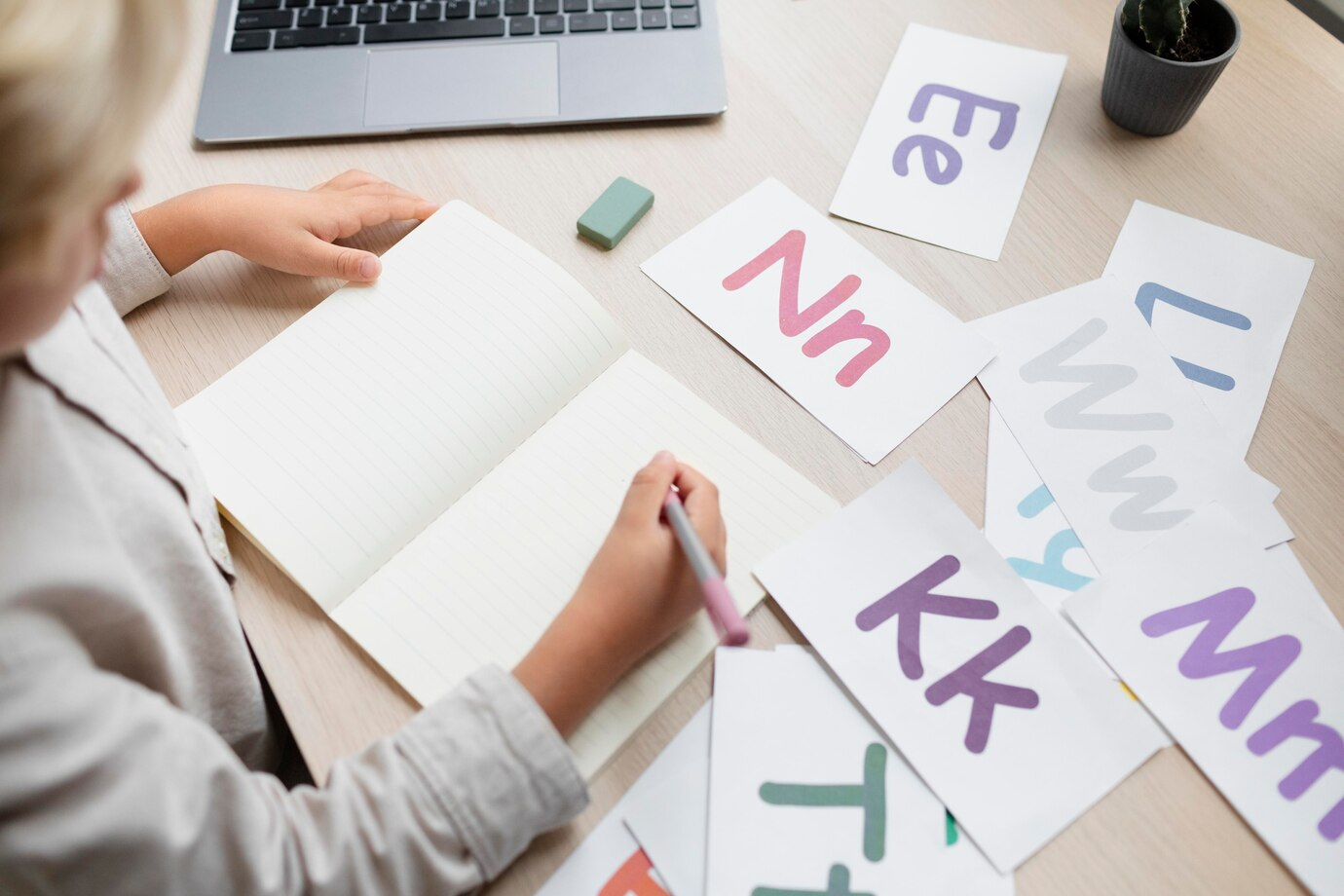
The Role of Typography in Mobile App Design: Creating Readable and Engaging Interfaces
Share

In today’s digital age, mobile apps have become an essential tool for engaging with users and providing services. From social media platforms to financial services apps, the mobile interface plays a crucial role in how users interact with content. While design elements such as color schemes, layouts, and navigation systems are often the focus of attention, typography—the style and appearance of text—is a key factor that significantly impacts the usability and overall success of a mobile app.
Typography is more than just choosing a font; it’s about creating a balance between aesthetic appeal and functionality. The right typography can make an app intuitive, easy to use, and enjoyable, while poor typography choices can lead to confusion, frustration, and disengagement. In this article, we will explore the role of typography in mobile app design and how it contributes to creating readable and engaging interfaces. We will also dive into a real-world use case where a financial services company redesigned its mobile app with bold, clean typography to improve the readability of financial data and reports, ultimately enhancing the user experience.

Why Typography Matters in Mobile App Design
Typography in mobile app design plays a vital role in ensuring that users can easily read and engage with the content. Good typography improves the clarity of information, guides users through the app’s interface, and establishes a visual hierarchy that makes the content more accessible and engaging.
Unlike desktop or web apps, mobile apps are often viewed on smaller screens, which makes the choice of typography even more critical. With limited screen space, the text must be legible, concise, and appropriately sized to avoid overwhelming the user. Furthermore, users typically interact with mobile apps in a variety of environments, such as while commuting or on-the-go, which means that typography must account for varying levels of attention and focus.
The main objectives of typography in mobile app design are:
-
Readability: Ensuring that the text is easy to read on a small screen.
-
Accessibility: Catering to different user groups, including those with visual impairments or disabilities.
-
Aesthetic Appeal: Creating an engaging and visually pleasing design that aligns with the app’s overall branding and tone.
-
Functionality: Supporting the app’s functionality by making navigation intuitive and data presentation clear.
Key Elements of Typography in Mobile App Design
Several key elements contribute to effective typography in mobile app design. Let’s break down these elements and examine how they impact the user experience:
1. Font Selection
The choice of font is the foundation of any typography design. There are two main categories of fonts used in app design: serif and sans-serif. Serif fonts have small lines or strokes attached to the ends of their characters, while sans-serif fonts do not. In most cases, sans-serif fonts are preferred for mobile app design due to their clean and modern look, as well as their enhanced readability on small screens.
However, font selection goes beyond just aesthetics. Developers must also consider performance. Some custom or complex fonts can negatively impact the app's loading speed, particularly when used extensively. It’s important to strike a balance between visual appeal and performance efficiency.
2. Font Size
Font size is a critical factor in ensuring readability. Mobile app users often access content on small screens, and fonts that are too small can lead to eye strain and frustration. As a general guideline, text in mobile apps should be large enough to be comfortably read without zooming in.
For body text, a font size of 16–18 points is commonly used, while headings and titles can range from 24–32 points. It’s also essential to consider that different devices have varying screen resolutions, so it’s crucial to test how the font size appears across different screen sizes.
3. Line Spacing and Character Spacing
Line spacing (the vertical distance between lines of text) and character spacing (the horizontal space between characters) are critical for maintaining readability and creating an open, uncluttered feel. Tight line spacing can make text difficult to read, while excessive spacing can create a disjointed reading experience.
For mobile apps, a line-height of 1.5x the font size is typically recommended to enhance readability. Proper character spacing, also known as kerning, ensures that letters do not appear too cramped or too distant from each other, making the text more legible.
4. Contrast
Contrast between text and background plays an essential role in readability, particularly in mobile environments where lighting conditions can vary. Text should stand out clearly from the background, whether it’s light text on a dark background or dark text on a light background.
One effective strategy is to use high contrast for primary content (e.g., black text on a white background or vice versa) and lower contrast for secondary or less important content. Designers should also be mindful of accessibility guidelines, ensuring that color choices support users with visual impairments.
5. Visual Hierarchy
Visual hierarchy refers to how different elements are arranged and styled to indicate their importance. In mobile app design, typography plays a crucial role in establishing this hierarchy. Titles, headings, and subheadings should stand out clearly from the body text, guiding users through the content in a structured and intuitive way.
This can be achieved by using variations in font size, weight (bold or regular), and color. Larger, bolder fonts are typically used for titles and headings, while smaller, regular fonts are reserved for body text.
6. Bold and Italics for Emphasis
In mobile app design, bold and italicized text can be used to emphasize key information. However, designers should use these styles sparingly to avoid overwhelming the user. Excessive use of bold or italicized text can make the content feel heavy or cluttered, detracting from the overall readability.
7. Responsive Typography
With the wide range of screen sizes available in today’s devices, responsive typography is essential for ensuring that text looks good on both large and small screens. By using scalable units like em or rem, rather than fixed pixels, designers can create text that adjusts automatically to the size of the user’s screen.
Responsive typography ensures that the app is accessible and usable on any device, whether it’s a smartphone, tablet, or large-screen device.
The Impact of Typography on User Experience
Good typography goes beyond aesthetics; it directly influences how users perceive and interact with the content of an app. Here’s how effective typography improves user experience:
1. Improved Readability
Readability is the most critical function of typography. If users cannot easily read the content in an app, they are likely to become frustrated and abandon the app altogether. By choosing legible fonts, appropriate sizes, and optimal line spacing, designers can ensure that the text is clear and easy to read.
In mobile apps where data is often presented in long lists or complex formats, clear typography helps users absorb information more quickly. For instance, in financial apps where numbers and reports are displayed, bold and clear fonts make it easier for users to analyze data at a glance.
2. Enhanced Accessibility
Typography also plays an essential role in making apps accessible to all users, including those with visual impairments or other disabilities. Adhering to accessibility guidelines, such as ensuring sufficient contrast between text and background, helps create an inclusive user experience. Features like adjustable font sizes and screen readers can also improve accessibility, allowing users to customize the app to meet their specific needs.
3. Guiding Users with Visual Hierarchy
Typography is a powerful tool for creating visual hierarchy, guiding users through the content in a logical flow. Clear headings and subheadings help users understand the structure of the content, while bold text can highlight important information. By establishing a clear hierarchy, users can easily navigate the app, find the information they need, and complete tasks more efficiently.
4. Building Brand Identity
Typography is a crucial element of a brand’s visual identity. The fonts and styles chosen for an app can convey the brand’s personality and tone. For example, a financial app might use bold, modern typography to convey professionalism and trustworthiness, while a lifestyle app might opt for playful, casual fonts to create a friendly and relaxed atmosphere.
By aligning typography with the brand’s identity, designers can create a cohesive experience that resonates with users and reinforces the brand’s message.
Use Case: Improving Financial App Usability with Typography
To understand how typography can transform user experience in mobile apps, let’s look at a real-world use case involving a financial services company that redesigned its mobile app using bold, clean typography to improve the readability of financial reports and data.
The Challenge:
The financial app was initially designed with small fonts and cluttered layouts, making it difficult for users to read and analyze their financial information. Customers frequently complained about the app’s confusing interface, particularly when reviewing their financial reports or transaction histories. The company needed to make the app more user-friendly by enhancing the readability of the data.
The Solution:
The design team decided to focus on typography as a key element of the app’s redesign. They implemented several typography changes to improve the user experience:
-
Bold, clean fonts were used for key data points, such as account balances and financial summaries, making the most critical information stand out.
-
The font size was increased for both titles and body text, ensuring that the text was easy to read on smaller screens.
-
Line spacing was adjusted to create a more open, airy feel, reducing visual clutter and making it easier for users to scan through their data.
-
High contrast between text and background was used to enhance readability, even in low-light conditions or on screens with glare.
-
A clear visual hierarchy was established, with larger, bold fonts used for headings and smaller fonts for secondary information.
The Results:
After implementing these typography changes, the app saw significant improvements in user experience:
-
Customer satisfaction increased by 20%, with users reporting that the app was easier to use and more intuitive.
-
Users were able to analyze their financial data more quickly, leading to a smoother and more efficient experience.
-
The app’s retention rate improved as users found it more engaging and useful.
This use case demonstrates how thoughtful typography can make a tangible impact on an app’s usability, helping users engage with content more effectively and delivering a more satisfying overall experience.
Conclusion
Typography is a fundamental aspect of mobile app design that directly influences readability, accessibility, and user engagement. By selecting the right fonts, sizes, spacing, and contrast, designers can create interfaces that are not only visually appealing but also highly functional and intuitive.
As seen in the case of the financial services app, improving typography can lead to significant enhancements in the user experience, helping users navigate complex data and complete tasks with ease. For any business looking to develop or redesign a mobile app, focusing on typography is key to delivering a product that resonates with users and drives long-term success.
Whether it’s improving readability, guiding users with visual hierarchy, or building a strong brand identity, typography is an essential tool for creating mobile apps that are both engaging and effective.

Share

Keep me postedto follow product news, latest in technology, solutions, and updates
Related articles
Explore all


