The Psychology of UX/UI: How Design Influences User Behavior
Share

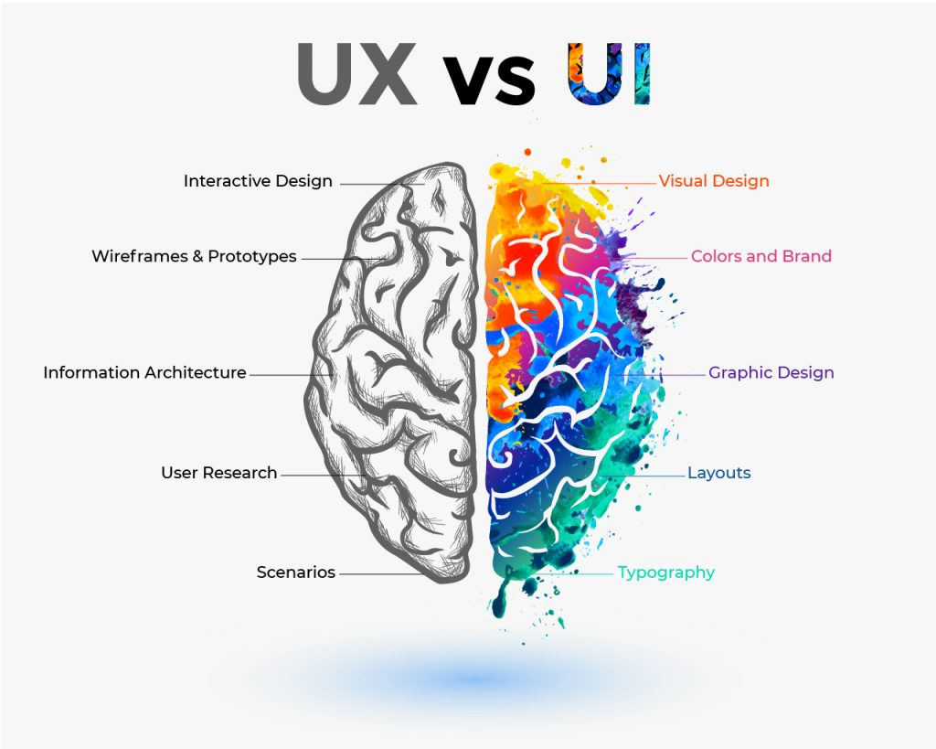
User experience (UX) and user interface (UI) design go beyond just aesthetics—they are deeply connected to human psychology. When users interact with a website or an app, they make subconscious decisions based on cognitive biases, visual hierarchy, and usability principles. By understanding how people think, designers can create interfaces that not only look appealing but also persuade users to take specific actions, such as making a purchase, signing up for a service, or engaging with content.
One of the most powerful psychological principles in UX/UI design is Hick’s Law, which states that the more choices a person has, the longer it takes for them to make a decision. This article explores how UX/UI design influences user behavior, explains Hick’s Law in detail, and presents a real-world case study of how an e-commerce platform improved its checkout process using this principle—resulting in a 30% increase in conversions.
The Connection Between UX/UI and Human Psychology
At its core, UX/UI design is about shaping user behavior. People interact with digital interfaces based on cognitive patterns and psychological triggers. If a website or app is designed in a way that aligns with these patterns, users are more likely to stay engaged, complete desired actions, and have a positive experience.
Some key psychological factors that impact UX/UI design include:
-
Cognitive Load: The mental effort required to process information. When a design is cluttered or complex, it overwhelms users and leads to frustration.
-
Familiarity and Recognition: Users prefer interfaces that feel intuitive, meaning they rely on prior experiences to navigate websites efficiently.
-
Decision Fatigue: When faced with too many choices, users feel overwhelmed and may abandon the decision altogether.
-
Visual Hierarchy: The way elements are arranged on a page affects what users notice first and how they interact with content.
One of the most effective ways to optimize UX/UI using psychology is by applying Hick’s Law, which simplifies decision-making and enhances usability.
Understanding Hick’s Law in UX/UI Design
What Is Hick’s Law?
Hick’s Law, named after British psychologist William Edmund Hick, states:
“The time it takes to make a decision increases with the number and complexity of choices available.”
In simple terms, the more choices a person has, the longer it takes them to decide. This principle has been widely studied in psychology and is particularly relevant in digital design, where users encounter menus, forms, buttons, and options that require decision-making.
For example:
-
A cluttered navigation menu with 15+ options may overwhelm users and cause them to leave the site.
-
A checkout page with too many payment methods may lead to indecisiveness and cart abandonment.
-
A homepage filled with too many CTAs (calls-to-action) can dilute the user’s focus and reduce engagement.
By reducing decision fatigue, UX/UI designers can guide users toward faster and more confident decision-making, improving conversion rates and overall user satisfaction.
Real-World Use Case: How an E-Commerce Platform Increased Conversions by 30%
The Problem: A Complex Checkout Experience
An online retail platform noticed a high cart abandonment rate, particularly at the checkout stage. Customers were adding products to their carts but leaving before completing the purchase. The company conducted user research and identified the following issues:
-
Too Many Payment Options: The checkout page displayed seven different payment methods, causing users to hesitate when selecting one.
-
Excessive Form Fields: The form required unnecessary information that increased cognitive load.
-
Multiple CTAs: Users were presented with several buttons (e.g., “Apply Coupon,” “Continue Shopping,” “Save for Later”), making it unclear which step to take next.
-
Distractions During Checkout: Unrelated product recommendations and promotional banners appeared on the checkout page, diverting user attention.
All these factors aligned with Hick’s Law—too many choices led to increased decision time, confusion, and drop-offs.
The Solution: Applying Hick’s Law to Streamline the Checkout Process
To combat these issues, the UX/UI team implemented the following improvements:
1. Simplified Payment Options
Instead of displaying seven payment methods, the platform reduced it to the top three most commonly used options, with a “More Options” dropdown for additional methods.
-
Before: All payment methods were displayed upfront, leading to indecision.
-
After: Only the top three payment methods were shown, and the dropdown reduced visual clutter.
Result: Users made quicker payment decisions, reducing checkout time.
2. Reducing Unnecessary Form Fields
Previously, the checkout form required unneeded information, such as secondary phone numbers and extra address details. The team conducted A/B testing and found that removing non-essential fields:
-
Decreased form completion time by 40%
-
Increased the number of successful transactions
Result: Users had a smoother experience, increasing checkout completion rates.
3. Clear, Single CTA for Action Focus
The original design had multiple buttons (“Continue Shopping,” “Apply Coupon,” and “Save for Later”) competing for user attention. This caused decision fatigue, making it unclear which action was the next step.
The revised design:
-
Emphasized one primary CTA: “Complete Purchase”
-
Moved secondary options (coupon codes, additional offers) to a separate, less prominent section
Result: A 25% reduction in checkout abandonment due to clearer navigation.
4. Removing Distractions During Checkout
To maintain user focus, unnecessary distractions were removed:
-
Product recommendations were moved to pre-checkout pages rather than the checkout flow.
-
Promotional banners were removed from checkout pages.
Result: A 15% improvement in checkout speed due to reduced distractions.
The Final Impact: A 30% Increase in Conversions
After implementing these UX/UI optimizations based on Hick’s Law, the e-commerce platform achieved significant improvements:
-
Cart abandonment rate decreased by 30%
-
Average checkout time reduced by 40%
-
Customer satisfaction scores improved based on post-checkout surveys
By simply reducing unnecessary choices and cognitive load, the company created a more user-friendly and efficient checkout experience.
Applying Hick’s Law to Your Own Website
Any business can apply Hick’s Law to improve UX/UI. Here’s how:
-
Streamline Navigation: Reduce the number of menu options to make navigation more intuitive.
-
Prioritize Key CTAs: Highlight the most important action users should take.
-
Simplify Forms: Remove unnecessary fields to speed up form submissions.
-
Minimize Decision Fatigue: Group related options, use progressive disclosure, and avoid overwhelming users with too many choices at once.
-
Test and Optimize: Use A/B testing to measure the impact of design changes.
Conclusion
Psychology plays a crucial role in UX/UI design, and principles like Hick’s Law can significantly enhance user experiences and business outcomes. By reducing complexity, minimizing decision fatigue, and providing clear, intuitive choices, businesses can increase engagement, conversions, and overall customer satisfaction.
If a simple checkout redesign can improve conversions by 30%, imagine the possibilities when these psychological principles are applied across an entire digital experience. In today’s competitive digital landscape, understanding user psychology isn’t just an advantage—it’s a necessity.

Share

Keep me postedto follow product news, latest in technology, solutions, and updates
Related articles
Explore all


