





Mobile-First UX/UI: Designing for the Modern Web

With mobile devices becoming the primary gateway to the internet, designing for mobile-first is no longer optional—it’s a necessity. Users expect fast, intuitive, and seamless experiences, whether browsing a website or using an app. A poorly optimized mobile design leads to frustration, high bounce rates, and lost engagement.
A social media app found that users struggled with small buttons and complex navigation on mobile devices. In response, the UX/UI team redesigned the interface with larger touch-friendly buttons, a simplified layout, and swipe-based navigation. These changes significantly improved usability and engagement.
This article explores why mobile-first UX/UI is essential, key principles for effective mobile design, and how real-world improvements transformed a social media app’s user experience.
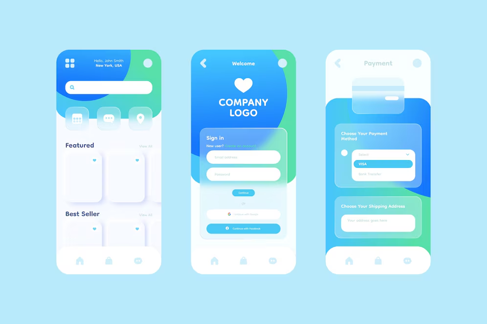
Why Mobile-First UX/UI Matters
1. The Shift to Mobile-First Browsing
-
Over 60% of global internet traffic comes from mobile devices.
-
Search engines like Google prioritize mobile-friendly websites in rankings.
-
Users expect instant access, fast load times, and intuitive navigation on mobile.
2. The Challenges of Mobile UX/UI
-
Small screens limit content visibility, requiring efficient design.
-
Touch-based interactions demand larger buttons and spacing.
-
Navigation complexity increases, especially for feature-rich apps.
3. How Mobile-First Design Benefits Users
-
Faster browsing and interactions, reducing frustration.
-
Better accessibility, accommodating different hand sizes and interaction styles.
-
Increased engagement and retention, keeping users on the platform longer.
A well-optimized mobile UX/UI ensures that websites and apps are usable, accessible, and enjoyable on small screens.
Case Study: Improving Mobile UX for a Social Media App
Identifying the Problem
A popular social media app noticed that mobile engagement rates were lower than expected, despite having a large user base. User feedback and analytics revealed several friction points in the mobile experience:
-
Small Buttons & Crowded Layout
-
Interactive elements were too small, causing accidental clicks.
-
Important actions (e.g., liking, commenting, sharing) were hard to tap accurately.
-
Complex Navigation & Cluttered Menus
-
Users had difficulty finding key features due to deep, multi-layered menus.
-
The navigation felt unintuitive, making it harder to move between sections.
-
Slow and Laggy Interactions
-
Animations and transitions felt sluggish on mobile devices.
-
The app required too many taps to complete basic tasks.
UX/UI Solutions Implemented
To address these issues, the UX/UI team focused on three key improvements:
1. Enlarging Buttons & Improving Touch-Friendly Interactions
Problem:
-
Users struggled to tap small buttons, leading to misclicks and frustration.
Solution:
-
Buttons were resized to meet mobile touch guidelines (minimum 48x48 pixels).
-
Increased spacing between interactive elements to prevent accidental taps.
-
Introduced gesture-based actions (e.g., double-tap to like, swipe to dismiss notifications).
Psychological Insight:
-
Fitts’ Law states that larger, well-placed buttons improve speed and accuracy in interactions.
2. Simplifying Navigation for a More Intuitive Flow
Problem:
-
The navigation menu was too deep and complex, making it hard for users to access key features.
Solution:
-
Shifted to a bottom navigation bar with five essential tabs, reducing the need for excessive taps.
-
Introduced a universal swipe gesture to switch between sections effortlessly.
-
Used floating action buttons (FAB) for frequently used actions, such as creating a new post.
Psychological Insight:
-
The Rule of Thumb: People use their thumbs for most mobile interactions, so placing navigation at the bottom improves usability.
3. Optimizing Performance & Reducing Load Time
Problem:
-
The app felt slow and unresponsive, especially on older devices.
Solution:
-
Reduced animation complexity to ensure smooth transitions.
-
Compressed images and media to improve loading speeds.
-
Implemented lazy loading for feeds, only loading content as users scroll.
Psychological Insight:
-
Instant feedback (e.g., loading indicators, subtle animations) makes users feel like actions are responsive, reducing frustration.
The Psychology Behind a Mobile-First UX/UI Approach
1. The Thumb Zone – Designing for One-Handed Use
-
People naturally interact with mobile devices using their thumbs.
-
Essential actions should be placed within easy reach at the bottom of the screen.
2. The Gestalt Principles – Creating a Clear, Organized Layout
-
Users prefer clean, uncluttered designs with intuitive groupings.
-
Proper spacing, contrast, and alignment improve readability and interaction.
3. The Speed Bias – Faster Responses Lead to Better Engagement
-
Users expect fast, near-instantaneous interactions on mobile.
-
Loading times longer than three seconds can lead to high drop-off rates.
Results and Key Takeaways
After the UX/UI improvements, the social media app saw major improvements in usability and engagement.
Key Takeaways for Mobile UX/UI Designers
-
Touch-Friendly Interactions Are Essential
-
Use larger buttons and increased spacing to prevent accidental clicks.
-
Implement swipe gestures for smoother navigation.
-
Simplify Navigation & Reduce Clutter
-
Prioritize bottom navigation bars for easier one-handed use.
-
Use clear, intuitive icons and fewer menu layers.
-
Optimize for Performance & Load Speed
-
Use lazy loading to improve content delivery.
-
Minimize animations and large media files to prevent lag.
-
Prioritize Readability & Visual Hierarchy
-
Use bold typography and ample white space for better readability.
-
Keep the interface minimalistic to focus on key actions.
-
Design for Different Device Sizes
-
Ensure responsive layouts that adapt to various screen sizes.
-
Test on different resolutions and orientations for a seamless experience.
By focusing on user behavior, cognitive psychology, and mobile-first principles, designers can create experiences that feel natural, intuitive, and engaging on small screens.
Conclusion
As mobile devices dominate internet usage, businesses and developers must prioritize mobile-first UX/UI design to stay competitive. The case study of this social media app demonstrates how strategic design improvements—such as enlarged touch areas, intuitive navigation, and performance optimization—can make a significant impact on usability and engagement.
By embracing mobile-first design principles, companies can create experiences that are fast, user-friendly, and optimized for modern digital interactions, ensuring that users stay engaged and return to the platform.
Investing in thoughtful, data-driven UX/UI improvements is not just about aesthetics—it’s about delivering a seamless, enjoyable mobile experience that users love.


Subscribe to follow product news, latest in technology, solutions, and updates
Other articles for you



Let’s build digital products that are simply awesome !
We will get back to you within 24 hours!Go to contact us Please tell us your ideas.







 28/11 Soi Ruamrudee, Lumphini, Pathumwan, Bangkok 10330+66 62 389 4599hello@sennalabs.com© 2022 Senna Labs Co., Ltd.All rights reserved.