How Simplified UX/UI Boosts Customer Trust for Financial Websites
Share

In the financial services industry, trust is everything. Customers are trusting your website not only with their sensitive financial data but also with their hard-earned money. A complex, confusing user experience (UX) can easily undermine this trust, leaving users frustrated and hesitant to engage with your services. On the other hand, a simplified, user-friendly UX/UI design can significantly enhance trust and improve user satisfaction, especially for new customers who are navigating your site for the first time.
This article explores how simplifying UX/UI design on financial websites can increase customer trust, reduce friction in the user journey, and ultimately lead to higher conversions. We’ll also dive into real-world use cases and actionable tips for improving your financial website’s design.
The Importance of Trust in Financial Websites
Financial websites, whether they offer banking, investing, insurance, or loan services, handle a wide range of sensitive data. Security and privacy concerns are at the forefront of customers' minds when they interact with financial services online. However, beyond just security features, a website’s design also plays a crucial role in building customer trust.
When customers find a website that is easy to navigate, has clear forms, and provides a seamless experience, they feel more confident in using the service. On the other hand, complex forms, confusing navigation, and overwhelming design elements can cause customers to question the reliability and professionalism of the service.
For financial institutions looking to build and maintain customer trust, simplifying the user experience (UX) and user interface (UI) is one of the most effective strategies.
Why Simplified UX/UI is Essential for Financial Websites
In the highly competitive financial services market, every touchpoint with a customer matters. The smoother and more intuitive the user journey is, the more likely customers are to trust your services. Here’s why simplified UX/UI can make such a significant impact on a financial website:
-
Clarity and Transparency: Financial websites often deal with complex information, such as loan terms, insurance policies, and investment plans. A simplified UX/UI design makes it easier to present this information clearly, allowing customers to understand the services they are choosing. This transparency builds trust, as customers are more likely to feel secure when they fully comprehend what they’re signing up for.
-
Enhanced Navigation: If a user has to hunt for information or services on your website, they are likely to get frustrated and abandon the site. Simplified navigation allows users to find what they need quickly and efficiently. Clear, concise menus, simple call-to-action buttons, and well-organized content are essential for guiding users through their financial decisions without confusion.
-
Reduced Cognitive Load: Financial decisions are already complex and often involve high-stakes choices. Adding a confusing or cluttered interface only increases the cognitive load on users, making them more likely to feel overwhelmed. Simplified UX/UI reduces unnecessary elements and distractions, allowing users to focus on the important information without feeling burdened by excess noise.
-
Improved Conversion Rates: A simple and intuitive UX/UI design leads to a smoother user journey, from browsing to signing up for services. When users can easily complete forms or access the information they need, they’re more likely to complete transactions. In the case of financial services, this could mean more users signing up for accounts, completing loan applications, or investing in financial products.
-
Positive Emotional Response: Simplified design often leads to a more aesthetically pleasing and less stressful experience. For financial websites, this is particularly important as users may already feel anxious about their financial decisions. A clean, user-friendly design can create a more positive emotional response, making users feel more at ease with the process.
Real-World Example: Simplifying Complex Forms
One common pain point for customers on financial websites is the complexity of online forms. Whether they are applying for a loan, opening a bank account, or registering for an insurance policy, long and complicated forms can cause frustration and lead to abandoned applications. In many cases, users simply don’t have the patience to fill out these forms, especially when they seem overwhelming.
Example Case: A Loan Application Website
Imagine a financial institution offering personal loans online. The website’s loan application form is long, with multiple pages of questions about income, employment history, and personal details. On top of this, the form uses industry jargon that many users find difficult to understand.
To address this issue, the website’s team decides to simplify the application process by focusing on the following key UX/UI improvements:
-
Shortening and Breaking Up the Form: Instead of one long form, the team breaks it into manageable sections with progress indicators. Each section is focused on one area (e.g., personal information, financial details, loan preferences). This makes the form less intimidating and easier to complete.
-
Using Simple Language: The form is rewritten to use clear, concise language that customers can easily understand. Unnecessary jargon is removed, and tooltips or explanations are added next to complex terms to clarify their meaning.
-
Real-Time Error Checking: As users fill out the form, the system checks for errors in real-time (e.g., missing fields or incorrectly formatted information). This reduces frustration by helping users catch and correct mistakes instantly rather than submitting a form only to receive a generic error message.
-
Pre-Populating Fields: Whenever possible, the website automatically pre-fills fields based on data already available, such as customer contact information. This reduces the amount of effort required from the user and helps speed up the process.
As a result of these changes, the loan application completion rate improves significantly. The website experiences fewer abandoned applications, as users feel more confident and comfortable completing the process. Moreover, the simplified, transparent form helps build trust, as users are no longer overwhelmed by the complexity of the application.
Key UX/UI Elements for Building Trust on Financial Websites
Now that we’ve explored the general benefits of simplified UX/UI design, let’s dive into some key design elements that can help build trust on financial websites.
-
Simplified Forms: As mentioned earlier, financial websites often require users to fill out forms. Simplifying these forms, breaking them into smaller sections, and providing real-time feedback can make the process less daunting. Use large input fields, auto-fill options, and clear labels to guide users.
-
Clear and Transparent Information: Financial decisions are important, and customers want to know exactly what they are signing up for. Ensure that the key information (e.g., loan terms, interest rates, fees) is presented clearly, without any hidden charges. Use tooltips, pop-ups, or explainer videos to provide additional details in an easily digestible format.
-
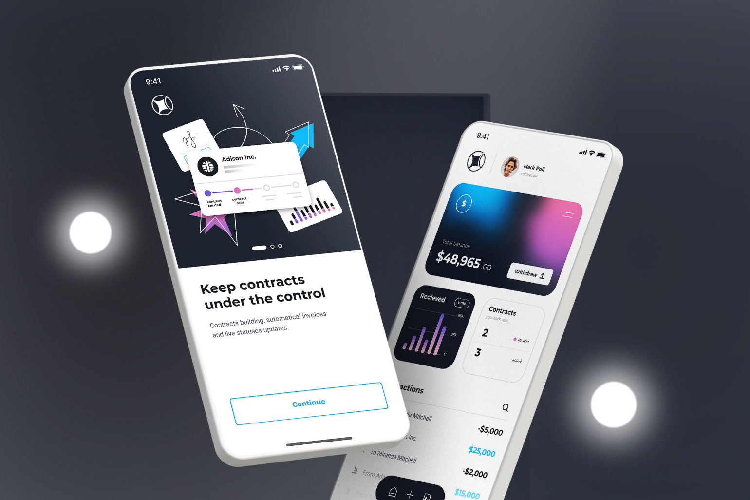
Secure, Easy-to-Use Payment Systems: Financial websites must ensure that users’ payment information is securely handled. Incorporating trusted payment gateways, displaying security badges, and using HTTPS encryption builds trust with users. Simplicity in the payment process—such as having a clear, single-click checkout option—also reduces friction and encourages users to complete their transactions.
-
Clear Call-to-Actions (CTAs): In a financial website, the purpose is usually to guide users toward taking an action, such as applying for a service or learning more about a product. Make sure that your CTAs are clear, concise, and strategically placed. For example, buttons like “Apply Now,” “Get Started,” or “Learn More” should be easily noticeable, giving users a clear path forward.
-
Social Proof and Testimonials: Positive reviews, testimonials, and case studies can provide social proof that builds trust with users. Display customer success stories or industry ratings that highlight your website’s credibility.
-
Fast Load Times: Websites that load quickly are more likely to keep users engaged and build trust. A slow, clunky website may frustrate users, leading to increased bounce rates and a loss of trust. Optimize your website’s performance to ensure it loads quickly on all devices.
Conclusion
In a highly competitive industry like financial services, the design of your website plays a crucial role in building trust and increasing conversions. Simplifying the UX/UI design by focusing on clarity, usability, and transparency can significantly improve customer satisfaction and enhance the overall user experience. By making your financial website easy to navigate, with clear forms, transparent information, and secure payment systems, you not only reduce friction but also show your customers that they can trust your services.
Simplified UX/UI design doesn’t just make your website more accessible—it creates a seamless, enjoyable experience that encourages users to engage, complete transactions, and return. So, if you want to boost customer trust and improve conversions, consider adopting a more streamlined, user-friendly approach to your website’s design today.

Share

Keep me postedto follow product news, latest in technology, solutions, and updates
Related articles
Explore all