From Complexity to Clarity: Applying User-Centric Design to Your Ecommerce Store

In the fast-paced world of e-commerce, user experience (UX) plays a pivotal role in determining whether a customer completes a purchase or abandons their shopping cart. For many online stores, especially those with complex navigation or lengthy checkout processes, cart abandonment is a common challenge. Users get frustrated, lose interest, or simply feel overwhelmed, and they leave without making a purchase. One of the key ways to address this issue is by applying user-centric design to the website, particularly in the checkout process.
In this article, we’ll explore how an e-commerce store facing high cart abandonment can implement user-centric design principles to simplify the checkout flow, reduce friction, and increase conversions. We’ll take a look at a real-world use case and walk through the steps of transforming a complex checkout experience into a smooth, intuitive process.

The Problem: Cart Abandonment Due to Complex Checkout
Imagine an e-commerce store selling fashion and accessories. The store has a solid catalog of products, a well-designed homepage, and a large number of visitors. However, the conversion rate is lower than expected. The main culprit? Cart abandonment. A significant percentage of users abandon their shopping carts during the checkout process, which means that despite browsing and adding items to their carts, they don’t complete the purchase.
Upon analyzing the checkout process, the e-commerce business realizes that the main reason behind the abandonment is complexity. There are too many steps involved, too much information to fill out, and several unnecessary distractions. For instance:
-
Customers must fill out long forms for shipping and payment information.
-
The website asks for details that are irrelevant to the purchase, such as optional sign-ups for newsletters.
-
The checkout flow is not linear, requiring users to go back and forth between pages to review items, shipping options, and payment methods.
-
There is no progress indicator, leaving customers unsure of how many steps are left.
All of this creates friction—a barrier to completing the purchase. As a result, customers get frustrated and leave the site before finalizing the transaction.
The Solution: Simplifying the Checkout Flow with User-Centric Design
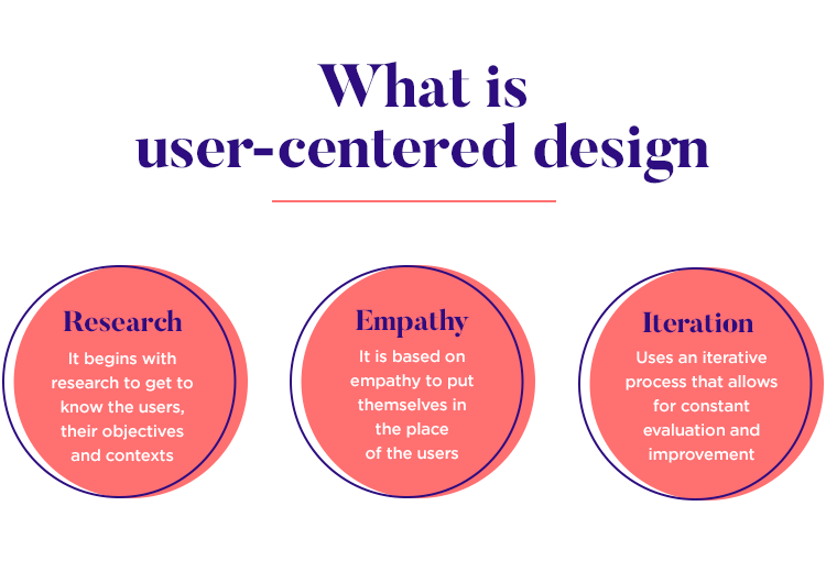
To reduce cart abandonment and improve conversions, the store needs to focus on user-centric design—a design philosophy that prioritizes the needs and behaviors of users at every step of the experience. By simplifying the checkout process and removing unnecessary steps, the store can make the purchasing journey smoother and more intuitive.
Here are the steps the e-commerce business can take to apply user-centric design and enhance the checkout experience:
1. Streamline the Checkout Process
The first step is to simplify the checkout flow. The goal is to minimize the number of actions a user needs to take to complete a purchase. The more steps or forms a customer has to fill out, the higher the likelihood that they’ll abandon their cart.
Solution: The store decides to reduce the checkout process to just two or three steps. Instead of multiple pages for shipping information, payment details, and order review, the checkout process is consolidated into a single page. Users can review their cart, enter their shipping and payment details, and finalize their order without having to navigate to different pages.
Result: By eliminating unnecessary pages and reducing the steps required, the store makes the checkout process quicker and more intuitive, ultimately leading to fewer drop-offs and higher conversion rates.
2. Simplify the Forms
Forms are often a pain point for users during checkout. Asking for too much information or irrelevant details can create frustration and increase cart abandonment rates. For instance, requiring users to fill out unnecessary fields like a secondary phone number or optional newsletter subscriptions can discourage them from completing their purchase.
Solution: The store revises its forms to ask for only the essential information—name, shipping address, payment method, and contact details. Any optional fields, like newsletter sign-ups or promotional preferences, are removed from the checkout process entirely. Additionally, the store implements auto-fill functionality where possible, such as auto-filling address fields based on postal code or offering users the ability to save their payment information for future purchases.
Result: The forms are now simpler, faster to fill out, and less overwhelming for the customer. With fewer fields to complete, customers are less likely to abandon their carts.
3. Offer Multiple Payment Options
One of the common frustrations for customers is being limited to a single payment option. If users don’t see a payment method they trust or prefer, they may abandon the cart altogether.
Solution: The store expands its payment options to include credit/debit cards, PayPal, Apple Pay, Google Pay, and even cryptocurrency. By offering multiple payment methods, the store ensures that users can choose the one they feel most comfortable with.
Result: Providing a variety of payment options helps increase user trust and convenience, leading to a smoother transaction process. As a result, customers are more likely to complete their purchases without any hesitation.
4. Add a Progress Indicator
A major source of frustration in the checkout process is not knowing how many steps are left. Without a progress indicator, users can feel uncertain about how long it will take to complete their purchase.
Solution: The store implements a progress bar at the top of the checkout page that shows users how many steps are left in the process. This simple visual cue lets users know exactly where they are in the process and how much further they need to go to complete their purchase.
Result: Users feel more confident in the checkout process and are less likely to abandon their cart due to uncertainty about the steps involved.
5. Optimize for Mobile Devices
With mobile shopping becoming increasingly popular, it’s crucial to ensure the checkout process is optimized for mobile devices. A cluttered, difficult-to-navigate mobile checkout experience can lead to high abandonment rates.
Solution: The store designs its checkout page with responsive design principles, ensuring that the page adapts seamlessly to any screen size. Form fields are large enough to tap on mobile devices, and buttons are easy to press. The store also ensures that the mobile checkout process is fast and doesn’t require excessive scrolling.
Result: A smooth, mobile-optimized checkout experience encourages users to complete their purchases, whether they’re on a desktop or mobile device. This significantly reduces mobile cart abandonment.
6. Provide Clear Shipping and Return Information
Confusion about shipping costs and return policies can deter customers from completing their purchases. Hidden fees or unclear information can result in cart abandonment.
Solution: The store ensures that shipping costs and return policies are clearly displayed before the customer proceeds to checkout. Shipping options are transparent, and return policies are easy to find, with links to detailed pages if needed.
Result: Clear and upfront shipping and return information builds trust with customers and reduces hesitation, leading to higher conversion rates.
7. Offer Guest Checkout
Requiring customers to create an account before completing their purchase can be a barrier for many users, especially those who want to make a quick purchase without the hassle of signing up.
Solution: The store introduces a guest checkout option, allowing users to make a purchase without creating an account. While the option to create an account is still available for users who wish to save their details for future purchases, the guest checkout option is made prominent.
Result: By offering a guest checkout option, the store removes one of the most common barriers to conversion and makes the process faster and easier for first-time customers.
The Results: Reduced Cart Abandonment and Increased Conversions
After implementing these changes, the e-commerce store sees remarkable improvements in the checkout process:
-
Reduced Cart Abandonment: By simplifying the checkout flow and eliminating unnecessary steps, cart abandonment rates drop significantly.
-
Higher Conversion Rates: With a more intuitive, streamlined process, customers are more likely to complete their purchases, leading to higher conversion rates.
-
Increased Customer Satisfaction: The simplified, user-friendly design creates a better overall shopping experience, increasing customer satisfaction and encouraging repeat business.
-
Improved Mobile Sales: A responsive, mobile-friendly checkout process leads to better sales performance across all devices, especially mobile.
Conclusion
Simplifying the checkout process and focusing on user-centric design can have a significant impact on your e-commerce store’s performance. By reducing friction, offering more payment options, and providing a clearer, faster path to purchase, you can reduce cart abandonment and increase conversions. For e-commerce businesses, a smooth, intuitive checkout experience is key to driving sales, improving customer satisfaction, and fostering long-term loyalty.


Subscribe to follow product news, latest in technology, solutions, and updates
Other articles for you


Let’s build digital products that are simply awesome !
We will get back to you within 24 hours!Go to contact us Please tell us your ideas.


