Dark Mode or Light Mode? Give Users the Choice They Crave
Share
For years, websites and applications defaulted to one visual presentation—typically bright, white backgrounds paired with dark text. It worked well for daylight use but created fatigue for users browsing in low-light environments. Enter dark mode, now a staple in modern UX that goes beyond visual preference to address accessibility, comfort, and even energy efficiency.
Today, offering users a choice between light and dark mode is no longer just a trend—it’s an expectation. Whether browsing late at night, trying to reduce eye strain, or simply enjoying a sleeker aesthetic, users want control over how they experience your platform.
This article explores why giving users the ability to toggle between light and dark mode is a smart design decision and how one food delivery app increased engagement and session duration by doing just that.
Why Theme Choice Matters in UX
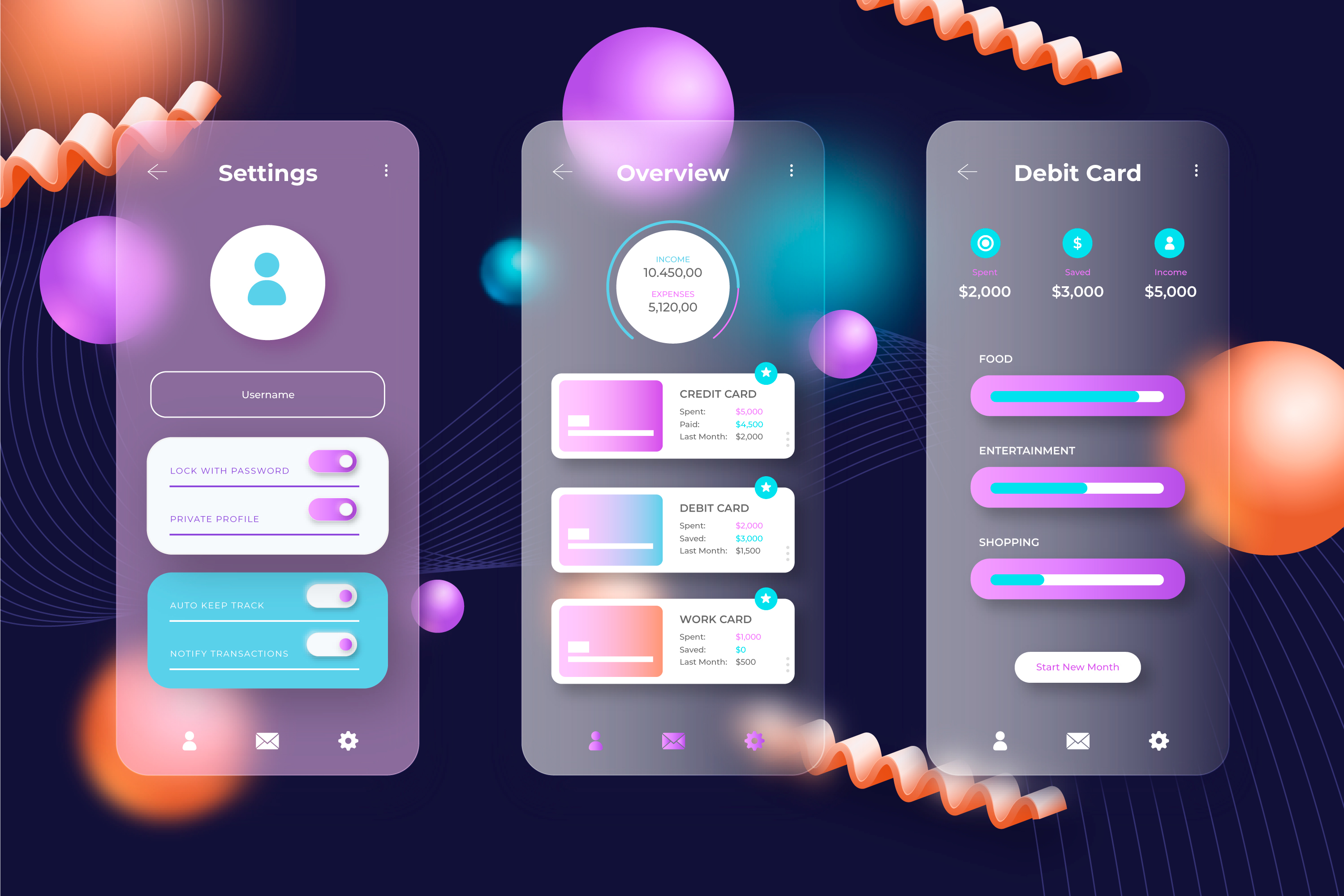
User interface themes are more than just colors. They influence how users interact, how long they stay, and how comfortable they feel. Allowing theme switching respects individual preferences and device contexts, such as:
-
Late-night browsing habits
-
Accessibility needs for users with light sensitivity
-
Power-saving on OLED screens
-
Aesthetic consistency with operating systems
By giving users a choice, you’re not just improving usability—you’re building trust and demonstrating attention to detail.
The Benefits of Offering Theme Switching
1. Reduced Eye Strain
Dark mode is easier on the eyes in low-light environments. It reduces glare and can make prolonged reading or usage more comfortable, particularly for users who work at night or have vision-related issues.
2. Extended Session Duration
Users who feel comfortable stay longer. If they’re browsing at night, a bright white screen may discourage continued use. A dark mode option can improve retention and user satisfaction during off-hours.
3. Improved Accessibility
Theme toggles support accessibility guidelines by giving users control over contrast and brightness—particularly valuable for those with migraines, dyslexia, or light sensitivity.
4. Battery Efficiency
Dark mode can help conserve battery life on OLED and AMOLED displays by using less power for darker pixels. This is a subtle but appreciated feature for mobile-first platforms.
Case Study: Food Delivery App Boosts Engagement with Theme Toggle
A popular food delivery app wanted to enhance its late-night user experience. While overall app usage was high, internal data showed that session durations dropped significantly after 9 PM—despite a high number of late-night food orders.
What They Found:
-
The app’s bright interface was straining users’ eyes in low light
-
Competitor platforms already offered dark mode
-
Users were turning down screen brightness or switching apps entirely
What They Did:
-
Introduced a toggle in the settings menu allowing users to switch between dark and light modes
-
Automatically detected system-level preferences and matched the app accordingly
-
Ensured that both modes offered visual consistency and brand alignment
The Result:
-
Over 43% of users enabled dark mode, especially during the evening
-
Session durations increased, with users spending more time browsing menus and tracking orders
-
Feedback highlighted greater comfort and visual appeal
-
The brand positioned itself as modern, user-centric, and attentive to user needs
What changed? Not the features—just the flexibility of presentation.
Design Considerations for Implementing Light and Dark Modes
If you’re planning to give users theme control, consider these best practices:
1. Respect System Preferences
Many devices now offer system-level theme settings. When possible, detect and align with user preferences automatically while offering a manual override.
2. Ensure Readability
Contrast ratios matter. In dark mode, avoid light grey text on black or vibrant neon hues that can strain the eyes. Maintain accessibility standards for text and UI elements.
3. Keep Brand Consistency
Don’t lose your brand identity. Your color palette should adapt across themes without losing recognizability. Use neutral adjustments and color variables.
4. Provide a Seamless Toggle
Allow users to switch themes easily, ideally within a visible settings menu or profile section. Changes should be instant and not require page reloads or navigation.
5. Test Across Devices
What looks good on desktop may not render well on mobile. Be sure to test theme behavior across screen sizes and lighting environments.
Common Mistakes to Avoid
-
Using dark mode as an afterthought or gimmick
-
Not testing legibility across different devices
-
Forcing users to use one mode without option to switch
-
Using inconsistent color logic between light and dark modes
Final Thoughts: Choice Is the Ultimate UX Upgrade
Design is no longer one-size-fits-all. Just as users expect language preferences, font scaling, and content filters, they now expect visual personalization. Offering both dark and light mode tells users you care about how they experience your platform—not just what it offers.
By putting control in the users’ hands, you create a more inclusive, comfortable, and memorable experience. Sometimes, a simple toggle can be the difference between a short visit and a long-term customer.

Share

Keep me postedto follow product news, latest in technology, solutions, and updates
Related articles
Explore all
