Dark Mode Design for Mobile Apps: Balancing Aesthetics and Functionality
Share

In recent years, dark mode has become one of the most requested and implemented features in mobile app design. From entertainment platforms to social media and productivity apps, users are increasingly demanding an option to switch from the traditional light mode to dark mode. While dark mode offers aesthetic appeal, it also provides a range of functional benefits, especially for users who interact with apps in low-light environments.
Dark mode is more than just inverting colors or making the background dark. It requires careful design to ensure that the balance between aesthetics and functionality is maintained. A well-executed dark mode design can enhance user comfort, reduce eye strain, and even save battery life on certain devices. However, poor implementation can lead to readability issues, create jarring contrasts, or detract from the overall user experience.
This article explores the key considerations for designing dark mode in mobile apps, focusing on the balance between visual appeal and functionality. We'll also discuss a real-world use case of an entertainment streaming service that added dark mode to improve user comfort, particularly during nighttime use. The feature was well-received for reducing eye strain, especially for users who watch content in low-light environments, contributing to an overall improved user experience.
What is Dark Mode?
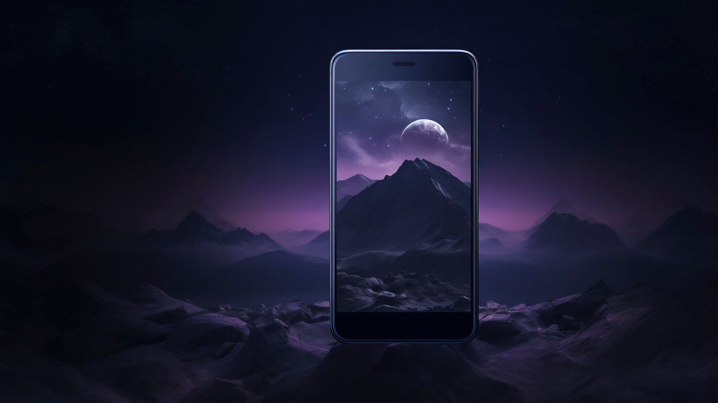
Dark mode is a design feature that allows users to switch the background of their app or operating system from a light color (usually white) to a darker color, typically black or dark gray. While dark mode has been around for some time—dating back to the early days of computing—it has gained renewed popularity in recent years with the rise of mobile apps, where users often engage with content for extended periods.
Dark mode is primarily intended to reduce the amount of bright light emitted by the screen, making it easier on the eyes, particularly in low-light settings. This is particularly important for users who browse their phones at night, in bed, or in dimly lit rooms. By reducing the intensity of light, dark mode can minimize eye strain and help users focus more comfortably on the content.
The Benefits of Dark Mode for Mobile Apps
-
Reduced Eye Strain One of the most significant advantages of dark mode is that it helps reduce eye strain, especially in low-light environments. When users interact with apps in dark mode, their eyes are exposed to less light, which can help prevent discomfort, fatigue, and headaches. This is particularly useful for apps that are used for long periods, such as reading apps, entertainment platforms, and social media.
-
Improved Readability in Low-Light Conditions Dark mode improves readability in low-light environments by reducing glare and harsh contrasts. When reading text on a bright screen in the dark, the stark contrast between the bright light and the surrounding darkness can strain the eyes. Dark mode softens this contrast, making it easier to read and engage with content without causing discomfort.
-
Battery Savings For devices with OLED or AMOLED screens, dark mode can lead to significant battery savings. These screens light up individual pixels, so when black pixels are displayed, the screen is effectively turned off for those areas, consuming less power. While this benefit is more pronounced on OLED displays, even devices with traditional LCD screens can experience a slight reduction in power consumption with dark mode.
-
Aesthetic Appeal Dark mode has a modern, sleek aesthetic that many users find visually appealing. The darker interface can create a sense of elegance and sophistication, which is particularly important for apps that prioritize user experience and design. Additionally, dark mode provides a sense of focus by minimizing distractions, allowing users to concentrate on the content at hand.
-
User Preference A growing number of users simply prefer dark mode as their default display setting. Whether for aesthetic reasons, comfort, or energy savings, many users now expect the apps they use to include a dark mode option. By offering dark mode, apps can meet user expectations and improve overall satisfaction.
Key Considerations for Dark Mode Design
While dark mode offers many benefits, designing for it requires careful attention to detail. Simply inverting the colors of a light mode interface will not result in an optimal dark mode experience. Instead, designers must focus on creating an interface that balances aesthetics with functionality, ensuring that users can still interact with the app easily.
1. Contrast and Legibility
One of the biggest challenges in dark mode design is ensuring that the text remains legible without creating excessive contrast that strains the eyes. In dark mode, the background is typically dark, while the text is light. However, if the contrast between the text and background is too extreme, it can cause discomfort or reduce readability.
To avoid this, designers should opt for muted whites and grays rather than pure white text. This creates a softer contrast that is easier on the eyes while maintaining legibility. Additionally, certain color combinations that work well in light mode may not translate effectively in dark mode. For example, brightly saturated colors on a dark background can cause color bleeding or become harder to read.
2. Color Scheme
Choosing the right color scheme for dark mode is essential for creating an aesthetically pleasing and functional design. Dark mode typically uses shades of black, dark gray, or dark blue as the background, while accent colors (such as buttons or links) should be carefully chosen to ensure they stand out without overwhelming the user.
Incorporating muted tones rather than bright, highly saturated colors is often more effective in dark mode. Colors that look good on a light background can feel too harsh or too dim on a dark background. For example, vibrant colors like bright red or neon blue may look fine on a white interface but become distracting in dark mode.
Designers should also consider how the app’s color scheme reflects the brand. The color choices in dark mode should remain consistent with the app’s overall branding and style, even if the hues are slightly adjusted for visibility.
3. Accessibility
Accessibility is a crucial consideration when designing dark mode. While dark mode can reduce eye strain for many users, it may not work for everyone. Some individuals with visual impairments may find it difficult to read light text on a dark background. Therefore, it's important to provide users with the option to toggle between dark mode and light mode based on their personal preferences.
Additionally, designers should follow accessibility guidelines to ensure sufficient contrast between the text and the background. Tools such as Web Content Accessibility Guidelines (WCAG) can help ensure that dark mode designs meet the necessary contrast ratios for readability and accessibility.
4. Visual Hierarchy
In dark mode, maintaining a clear visual hierarchy is essential to guide users through the app and help them focus on the most important elements. Since dark mode reduces visual distractions by dimming the background, it can be easier to highlight key information or features using color accents or larger fonts.
For example, in an entertainment app, the focus might be on the content (such as video thumbnails), while navigation buttons or secondary information are muted or subtly highlighted. This ensures that users can easily find and interact with the main content without feeling overwhelmed by other elements.
5. Consistency Across Devices
Dark mode should provide a consistent experience across all devices, whether users are on a smartphone, tablet, or desktop. This means that the design must be responsive and adaptable to different screen sizes and resolutions. Additionally, the dark mode interface should work seamlessly across different operating systems, such as iOS and Android.
Ensuring consistency is key to creating a unified user experience, regardless of the platform or device the app is accessed from.
Use Case: Dark Mode in an Entertainment Streaming Service
To illustrate the benefits of dark mode design, let's look at the example of an entertainment streaming service that implemented dark mode to improve user comfort and engagement. This platform allows users to browse and stream video content, often for long periods, which can lead to eye strain, especially in low-light environments such as at night or in dimly lit rooms.
Challenge:
Users of the streaming app reported discomfort when using the app in low-light settings, particularly during nighttime viewing sessions. The bright light emitted by the app's light mode was causing eye strain, leading to a less enjoyable experience. The company wanted to provide a solution that would make the app more comfortable to use, especially for users who stream content at night.
Solution: Introducing Dark Mode
The development team decided to implement a dark mode feature that would allow users to switch between light and dark interfaces based on their preferences. The dark mode was designed with a focus on reducing eye strain while maintaining readability and visual appeal.
Key design elements included:
-
Dark gray background: Rather than using pure black, the team opted for a dark gray background to reduce the intensity of contrast between the background and the text. This provided a more comfortable viewing experience without sacrificing readability.
-
Muted text colors: Light gray text was used instead of white to create a softer contrast, making it easier on the eyes in dark environments.
-
Accent colors: Key elements such as play buttons, thumbnails, and navigation were highlighted with soft accent colors to ensure that important features remained visible without being too bright.
-
Automatic mode switching: The app offered users the option to switch manually between light and dark modes, as well as an automatic setting that would switch to dark mode based on the time of day or the user’s device settings.
Results:
The introduction of dark mode had several positive effects on user experience:
-
Reduced eye strain: Users reported feeling more comfortable using the app in low-light environments, especially during nighttime viewing sessions. The softer contrast and dark background reduced the amount of light emitted by the screen, leading to less eye fatigue.
-
Increased user engagement: By providing a more comfortable browsing experience, the app saw an increase in user engagement, with users spending longer periods streaming content without feeling discomfort.
-
Positive feedback: The dark mode feature received positive feedback from users, with many praising its aesthetic appeal and functional benefits. This contributed to higher ratings and improved user satisfaction.
Best Practices for Implementing Dark Mode
If you're considering implementing dark mode in your mobile app, here are some best practices to ensure a smooth and successful rollout:
-
Test in Different Lighting Conditions: Dark mode should be tested in a variety of lighting environments to ensure that it performs well in both low-light and bright settings.
-
Provide a Toggle Option: Always allow users to switch between light mode and dark mode based on their preferences. Offering an automatic setting that adjusts based on time of day can also enhance the user experience.
-
Maintain Brand Consistency: Even in dark mode, the app's color scheme should reflect the brand’s identity. Adjust hues for readability, but keep the overall design consistent with the brand.
-
Ensure Accessibility: Dark mode must be accessible to all users, including those with visual impairments. Follow contrast and accessibility guidelines to make sure text remains legible for everyone.
Conclusion
Dark mode has become an essential feature in modern mobile app design, offering both aesthetic appeal and functional benefits. From reducing eye strain to improving battery life, dark mode provides a more comfortable and engaging experience, especially in low-light environments.
As seen in the example of the entertainment streaming service, the introduction of dark mode led to a more enjoyable user experience, increased engagement, and positive feedback. By balancing aesthetics and functionality, dark mode can be a valuable addition to any mobile app, offering users greater flexibility and comfort as they interact with digital content.
For developers and designers, implementing dark mode requires careful consideration of contrast, color schemes, and accessibility. When done well, dark mode can enhance user satisfaction and set your app apart in an increasingly competitive market.

Share

Keep me postedto follow product news, latest in technology, solutions, and updates
Related articles
Explore all
