Choosing Colors and Symbols for Users with Color-Blindness
Share
Color is a powerful visual tool. It can guide attention, indicate status, and create emotional impact. But for millions of users with color vision deficiency—commonly referred to as color-blindness—color alone may not convey the full picture. When websites rely solely on color to communicate meaning, they risk excluding users who perceive colors differently or not at all.
This article outlines practical tips for designing websites that remain clear and usable regardless of a user’s color perception. We’ll also look at a real-world case where a news website improved clarity and user trust by combining colors with universally understood symbols.
Understanding Color-Blindness
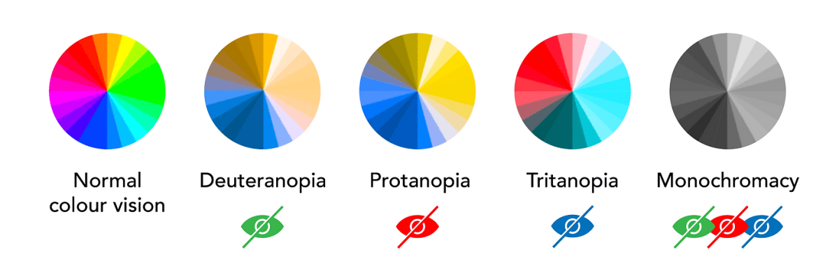
Color-blindness affects an estimated 1 in 12 men and 1 in 200 women globally. The most common types include:
-
Deuteranopia (red-green deficiency)
-
Protanopia (another red-green deficiency)
-
Tritanopia (blue-yellow deficiency)
Users with color-blindness may not distinguish between certain colors—especially red and green. That means color-based signals like buttons, alerts, or graphs may appear confusing or indistinct without additional cues.
Common Problems in Web Design
Relying on color alone can cause issues such as:
-
Status indicators (e.g., red = error, green = success) looking identical
-
Charts or graphs that use only color to differentiate categories
-
Interactive elements that don’t stand out enough for color-blind users
Accessible color use ensures that no one is left guessing.
Design Tips for Color Accessibility
1. Use High-Contrast Color Combinations
Good contrast benefits all users, especially those with low vision or color perception differences. The Web Content Accessibility Guidelines (WCAG) recommend a contrast ratio of at least:
-
4.5:1 for normal text
-
3:1 for large text (18pt and above)
Avoid problematic combinations like:
-
Red & green
-
Green & brown
-
Blue & purple
Instead, opt for high-contrast pairs like:
-
Black & white
-
Dark blue & light yellow
-
Navy & orange
Online tools like WebAIM Contrast Checker or Color Oracle can simulate color-blind views and help evaluate your palette.
2. Use More Than Color to Convey Meaning
One of the most important principles in inclusive design is: Never rely on color alone. Always pair color with another visual indicator, such as:
-
Text labels (e.g., “Error” or “Success” beside a colored dot)
-
Icons (e.g., checkmarks for success, exclamation marks for warnings)
-
Patterns or shapes in graphs or charts
Example:
-
Instead of just using red for “urgent” and green for “resolved,” show an icon:
-
🔴 + “Urgent”
-
✅ + “Resolved”
This way, even if a user can’t perceive the color difference, they still get the message clearly.
3. Label Interactive Elements Clearly
Buttons, toggles, and links should have clear text or icons, not just a color change on hover. For example:
-
Use underlines or bold font for links
-
Provide “hover” and “focus” styles that include shape or outline changes, not just color
This is especially important for users navigating with a keyboard or screen reader.
4. Accessible Data Visualizations
When presenting charts or graphs, include:
-
Direct data labels on bars or lines
-
Unique patterns or symbols in pie charts and legends
-
Text descriptions or summaries
Tools like Tableau, Power BI, and Chart.js allow you to customize colors and add data labels to ensure readability for all users.
Real Use Case: Making News Alerts Clear for All
A popular news website realized their alert system—color-coded headlines indicating article urgency or verification status—was causing confusion. Users with red-green color-blindness couldn’t distinguish between “breaking news,” “verified reports,” and “rumors” when each was indicated only by color.
To fix this, they added a simple but effective system:
-
Red dot + “Breaking”
-
Yellow triangle + “Developing”
-
Green checkmark + “Verified”
Now, each alert contains both color and icon, making it instantly understandable for all readers. This change reduced misinterpretation, increased trust in the platform, and required minimal design effort.
Final Thoughts
Designing for color-blind users is not about limiting creativity—it’s about enhancing communication. When you combine high-contrast colors with meaningful icons and labels, you ensure that everyone can engage with your content clearly and confidently.
By taking a few extra steps in your design process, you create a more inclusive web experience for the millions of users who see the world a little differently—and ultimately, for all users.

Share

Keep me postedto follow product news, latest in technology, solutions, and updates
Related articles
Explore all